Duration: 6 months Role: UX Research, Product Design
$10M ARR in under 1 year
TLDR: While on a discovery trip in Australia we uncovered a major need for a solution to manage construction quality standards. Based on many conversations with some of the biggest general contractors in Australia, New Zealand, Canada, the UK, and the US, I designed the first solution of its kind on the market. I was named in the patent for the tool, and in April 2020 we opened a Beta to 25 of the biggest companies from across the globe. Finding great fit, we continued to release additional features for our MVP, and GA launches, closing $10 million in annual recurring revenue within 10 months.
🇺🇸 This is exactly what we need. This is the holy grail. This is spot on for how we should be doing work. - KAES, US Construction Owner
The First Australia Visit
“No! We want to talk about ITPs and Incidents!” The tension in the room was palpable. We were in the room with representatives of some of the biggest construction companies in Australia and they were clearly not happy with how our 3 day “Innovation Lab” was going.
As the first Procore squad to travel down to Australia our mission seemed more along the lines of a meet and greet. The events and dinners for the week were organized by sales and we felt like we were there to sway construction decision makers by showing them we had a robust product and engineering team that built software by listening to its customers first.
Still, it was an opportunity to interface with users and incorporate their feedback into our Product strategy for the upcoming year. Thus, with our PM we decided to lead some exercises around prioritizing known feature requests.
We went through with our plan during the first day of the “Innovation Lab” (in quotes because we weren’t really innovating...yet). But our expectations were clearly misaligned with the expectations of the construction leaders gathered in the room. They seemed antsy, irritated, and unwilling to participate in the feature prioritizing activities we were trying to lead.
Eventually things came to a head, and after a day that felt like a total disaster, we met in the lobby of our hotel and decided to pivot. The next day we threw out all of our original plans and started asking questions about what the people in the room wanted to talk about: Inspection Test Plans (ITPs) and Incidents.
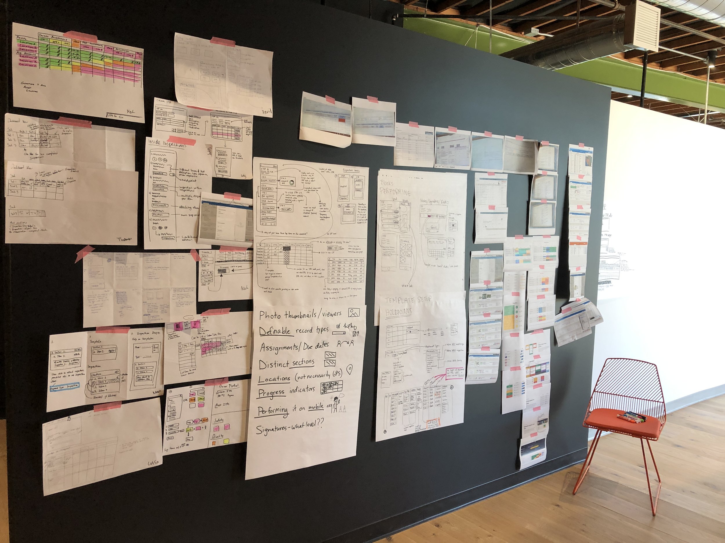
We looked at samples, took hours dissecting and mapping out the user journey together, and brainstormed how our tools could fill at least a portion of these needs. We even ended up live designing in the room.
Ultimately, we didn’t fully figure out what ITPs were or how they worked, but we had a great start, a ton of resources, and an excited group of construction leaders, who in the months to come would continue to send us samples, jump on 8am video calls, and even fly across the world to educate us more about the solution they desperately needed.
The Challenge
Right after our visit, Procore signed a deal with the biggest General Contractor in Australia. The deal came with stipulations and made clear, that for us to keep this client, and succeed in the Australian market, we would need to uplevel some of our tools in the Quality and Safety bundle. Three areas of focus emerged: adding functionality to our Incidents tool, developing an equipment tool, and building an ITPs tool.
ITPs became an ask of our team and I was asked to design a solution for this need in the Australian market. The Innovation Lab served as a good start, but I still didn’t fully understand what an ITP was, what it was used for, who it was used by, how it differed (or didn’t) across companies, and most importantly if it was only an Australian process or if it had any ties to “Work Packages” and “Definable Features of Work” I’ve heard a lot about from the domestic market.
What are ITPs?
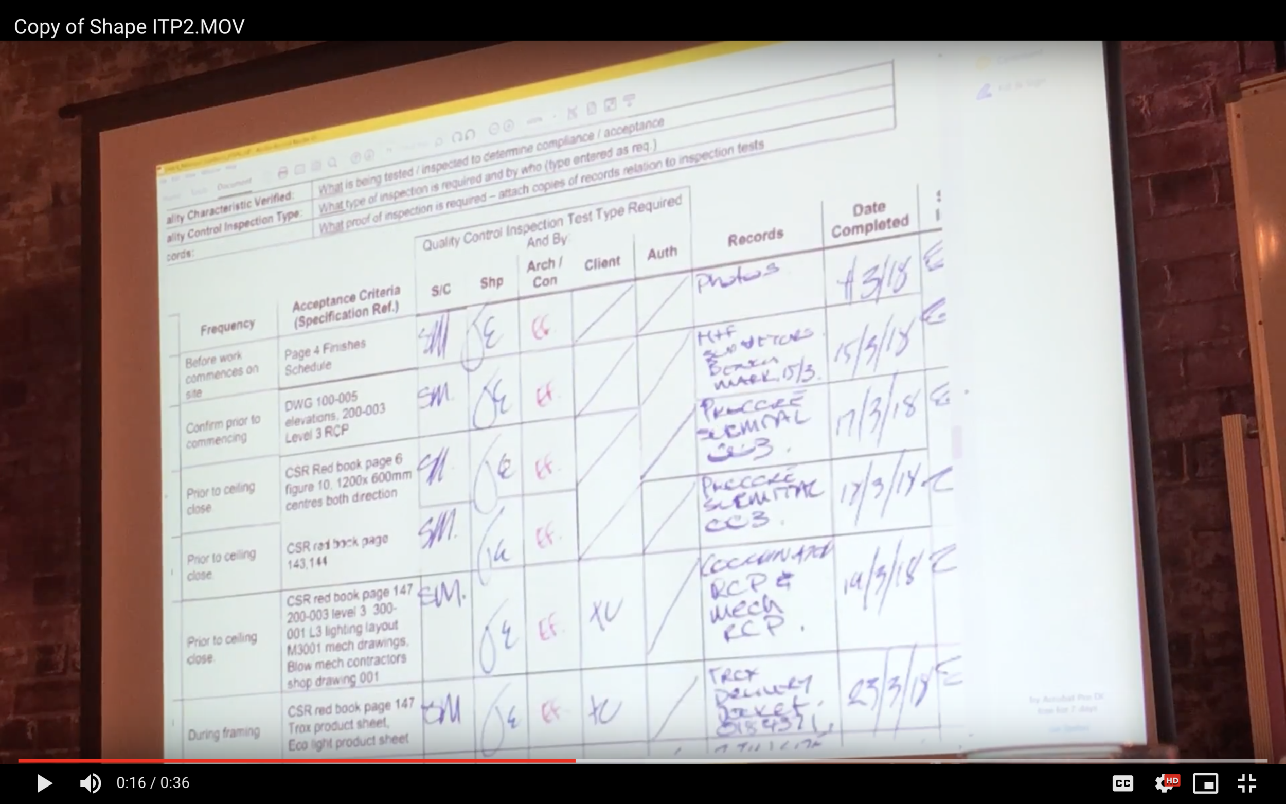
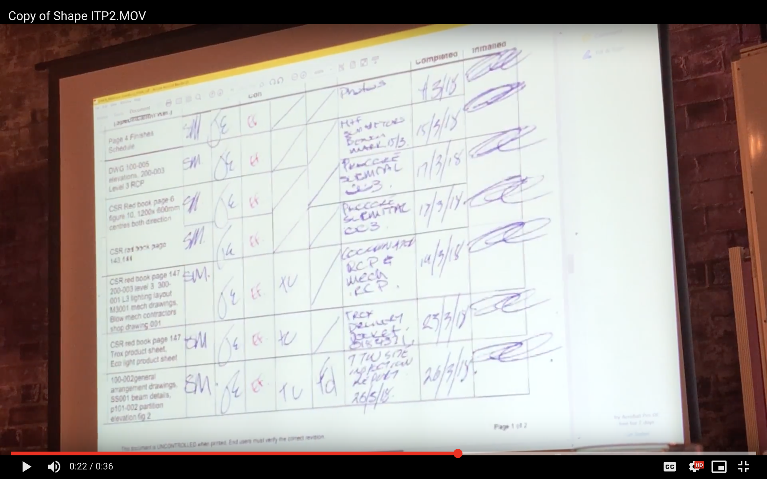
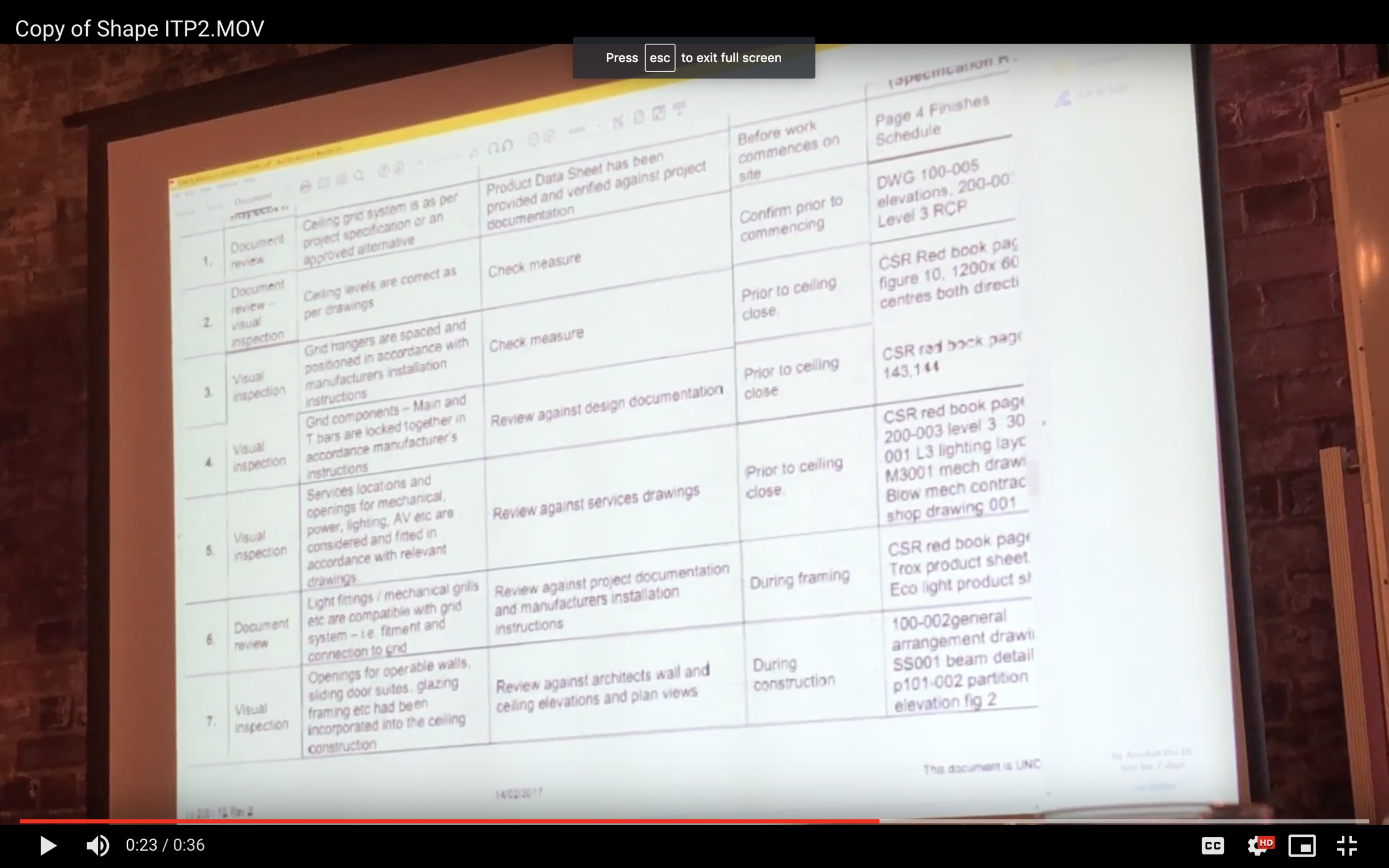
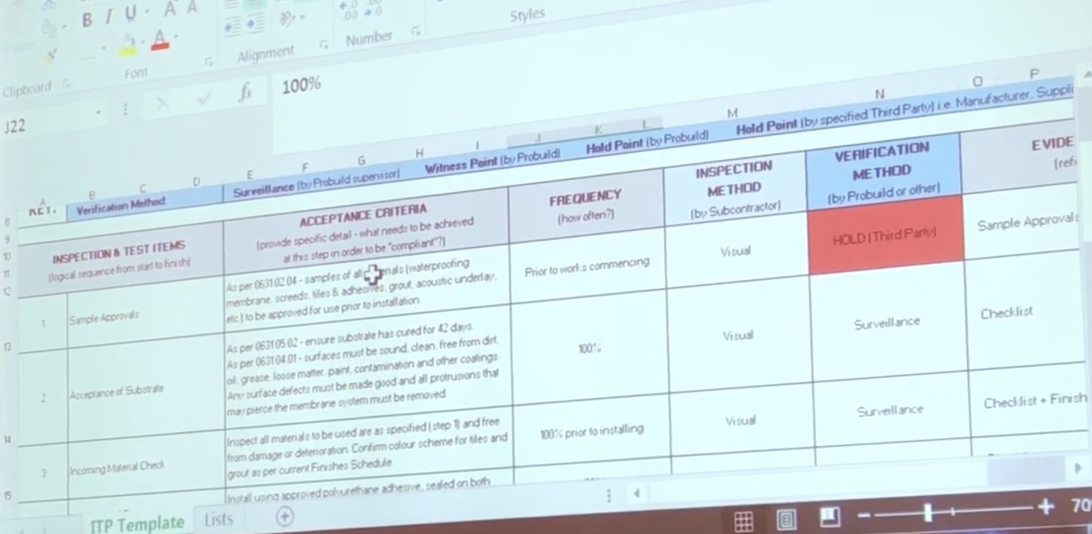
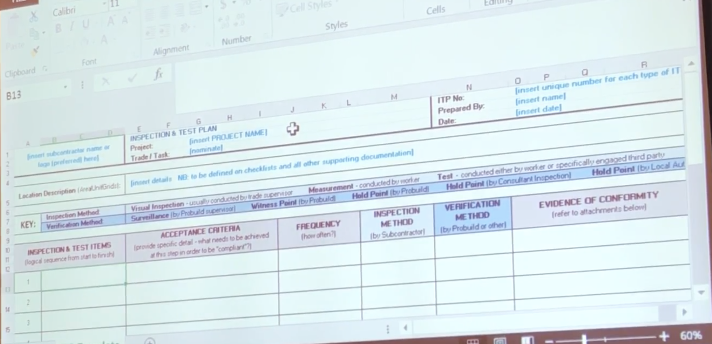
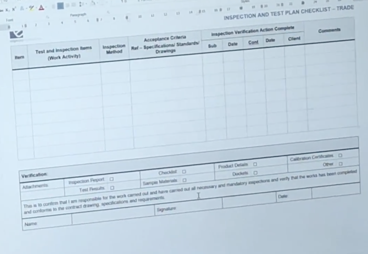
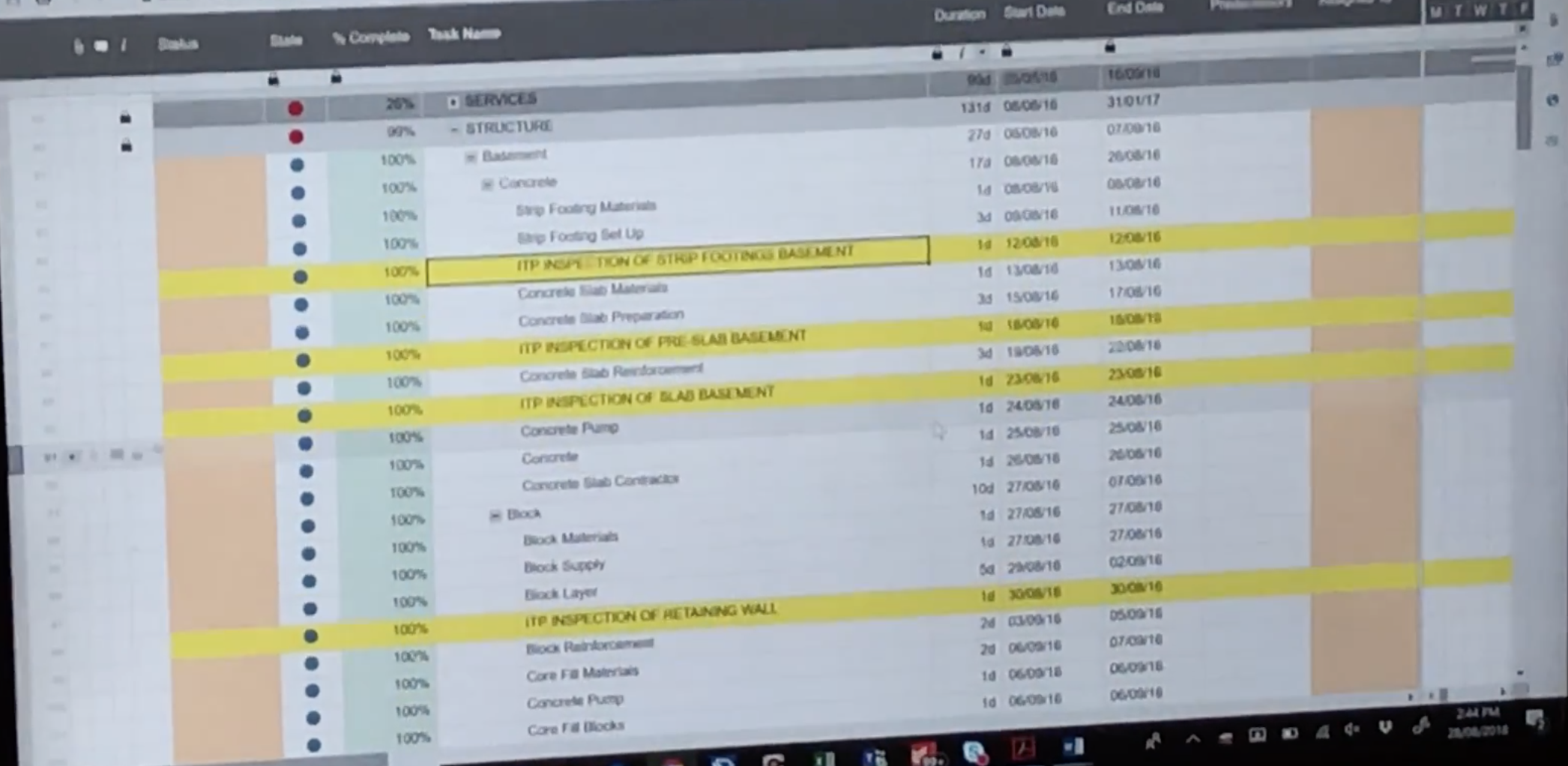
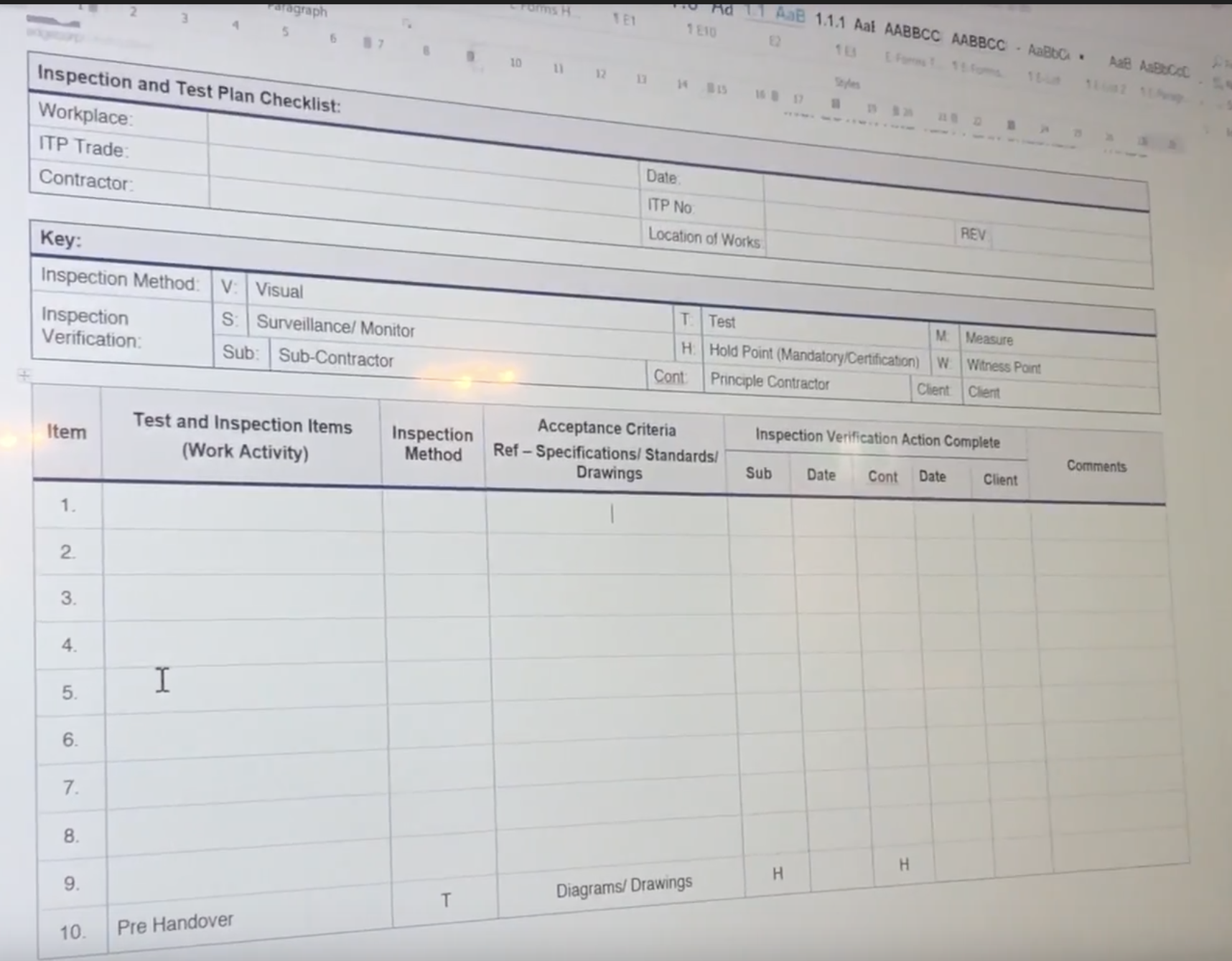
To better understand the problem I decided to revisit all of the material I filmed during the Innovation Lab. This proved to be immensely helpful, but I also turned to the internet and began accumulating definitions of ITPs, trying to find validation for what I was seeing in the Innovation Lab videos. Procore also has an amazing network of industry specialists and with the help of my PM I scheduled calls with the ones who were familiar with the concept of ITPs. Some even have worked directly setting up ITPs for their companies and so their input and explanations led me to finally understanding the ITP setup and performance process. Lastly, I tried to find competing software in the space, but none seemed to address this problem. I was quite surprised to find that the ITP quality assurance process is quite widely used in Australia, Canada, UK, New Zealand, and many European countries, but no matter where I looked I only encountered instances of paper based processes, or inefficient workarounds.
ITP Research Doc
Defining Constraints
The research phase gave me a thorough understanding of what ITPs are and I was able to define them as:
An agreed upon plan which implements monitoring and measuring activities at appropriate stages, in order to verify that the acceptable criteria for construction have been met.
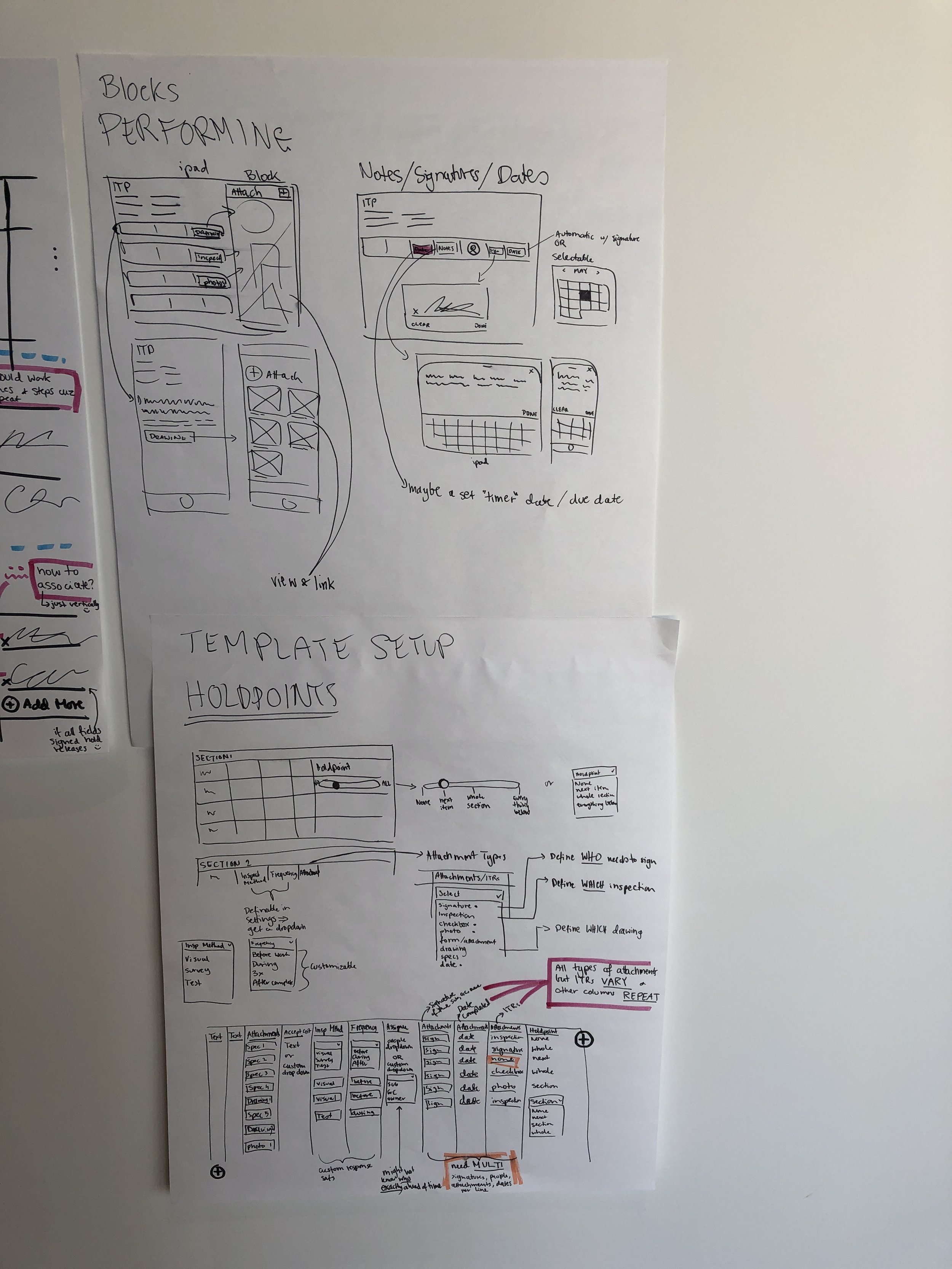
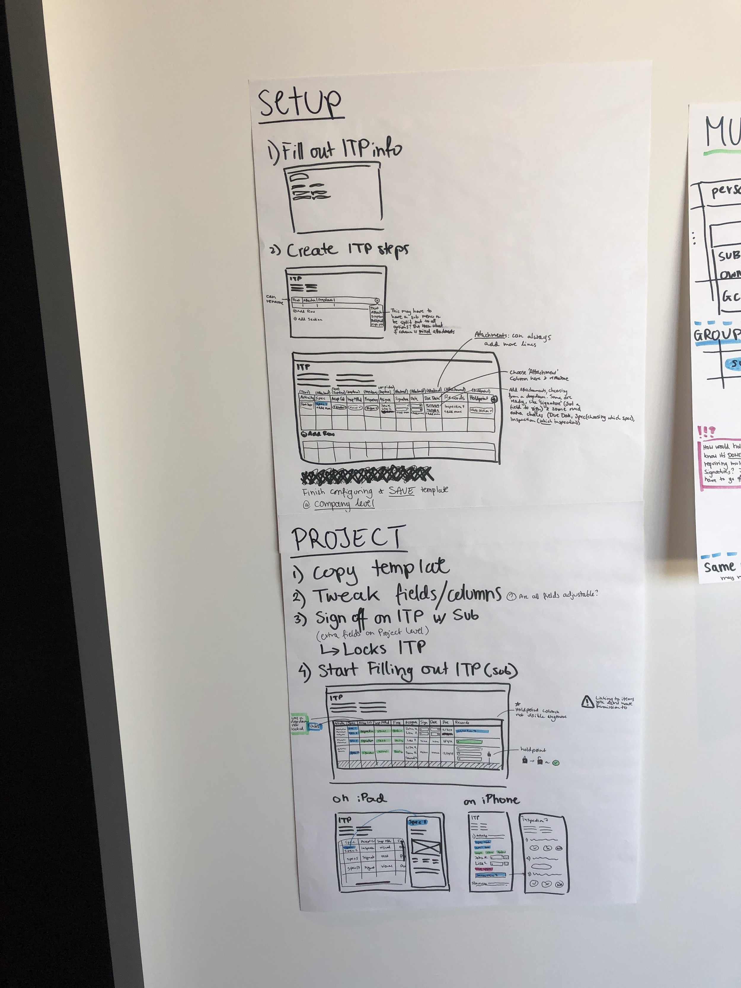
During the research phase I also created a Journey Map for the whole ITP process and refined it as I talked with subject matter experts and clients. This provided a visual representation of how an ITP is created and how it functions during and after the construction phase
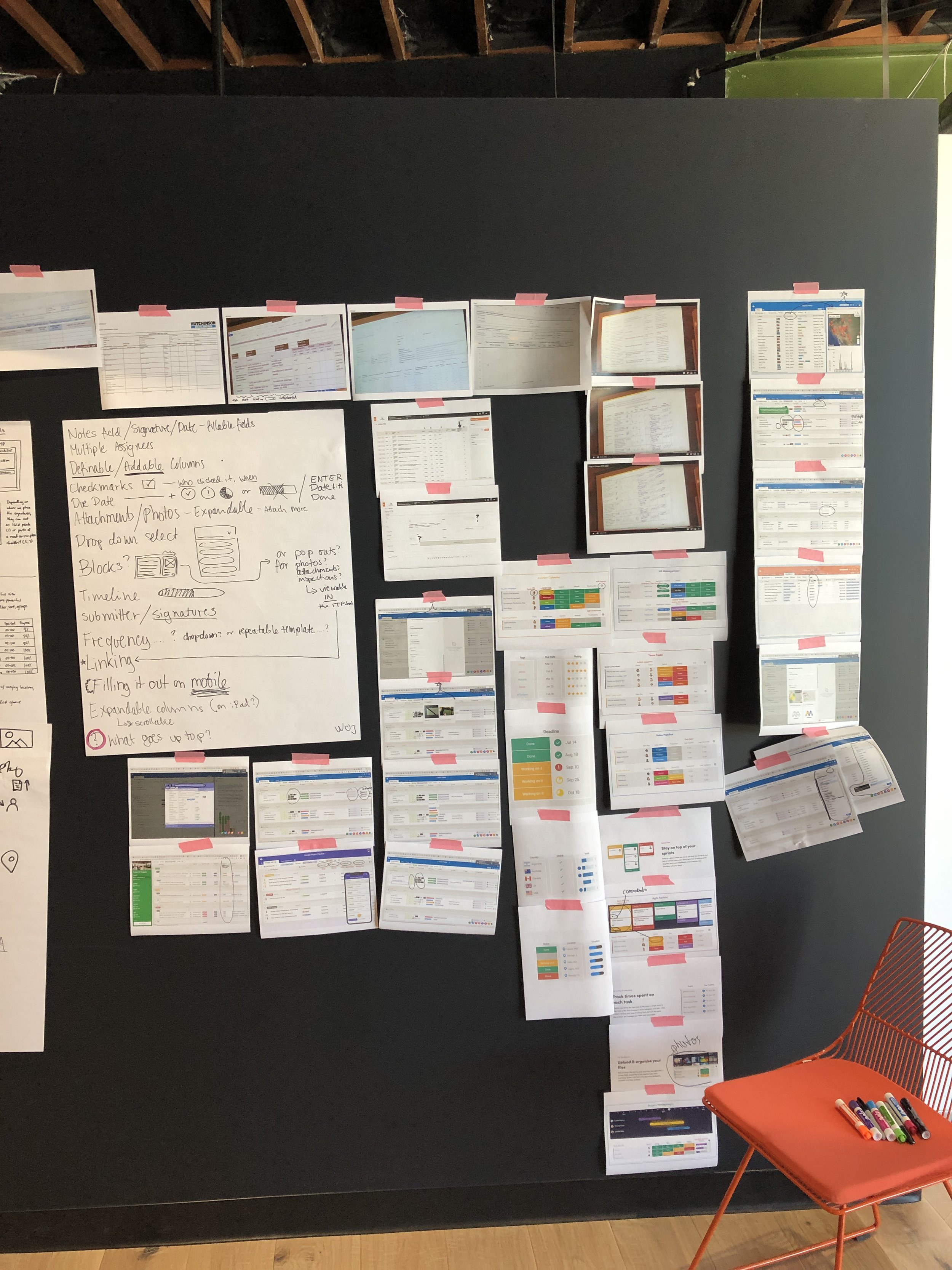
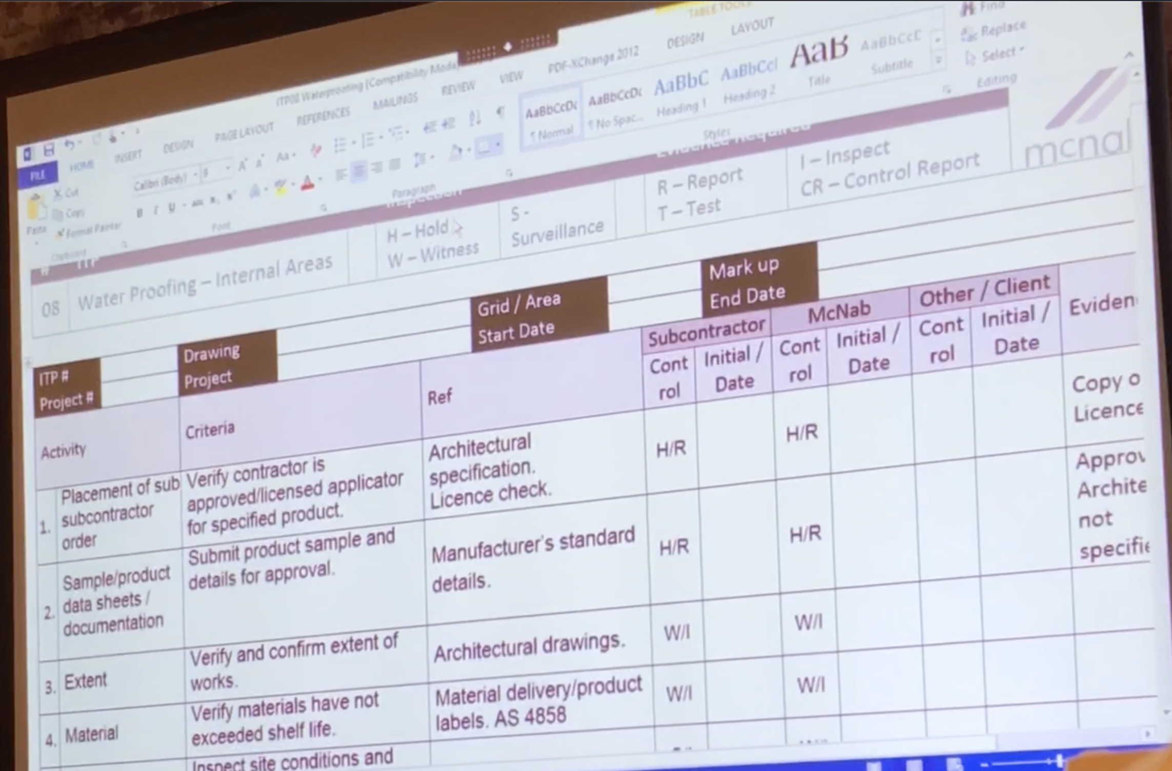
I also noticed a lot of informational overlap between the ITPs I found online, received from clients, and was sent by Procore’s construction experts. However, there were slight differences in naming, included columns, and ordering of information which I tried to distill to a single version that would satisfy the needs of all clients around the world.
Visually mapping corresponding ITP columns across companies.
Ideation
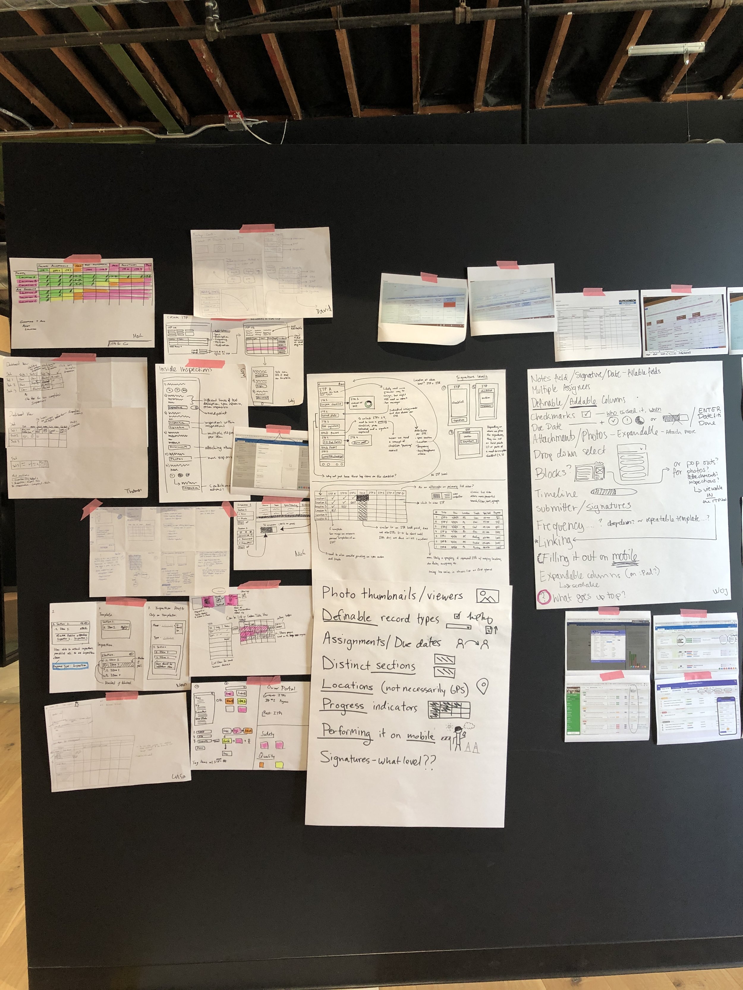
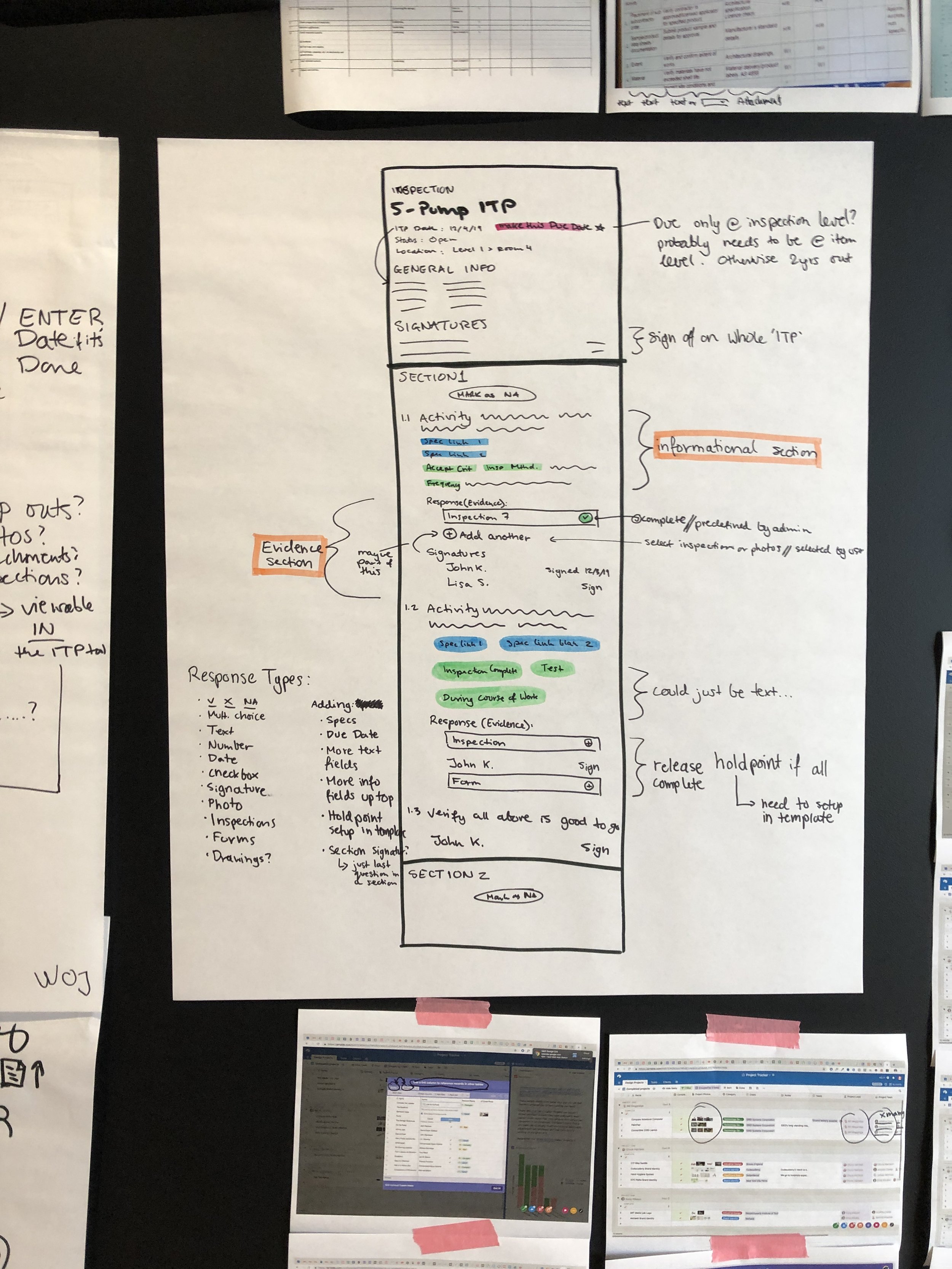
To kick off the ideation phase I wanted to involve the whole team so as to make everyone feel invested in the development of this new tool. I presented my research to the team and followed it with a crazy 8’s excercise. Next, everyone chose their favorite 2 ideas and presented it to the group.
Using the many ideas of my team members, examples of past ITPs, and examples of indirect competitors I began my own exploration of what the new ITP could look like. Among all the sources that I drew upon there were many recurring themes such as table views, status, and progress visualizations, that I wanted to incorporate into my designs.
Thomas, our backend engineer, presenting his ideas for an ITPs solution at the end of the workshop.
Testing Phase 1
From sketching, I narrowed my ideas to two favorites. I wanted to show all of the information that an ITP typically requires and that I have narrowed down during the synthesis phase. Still, I wanted to visually represent progress and not overwhelm the user with too much information on the screen. Thus I came up with one view which was more table based and more traditional in terms of the existing Procore system, and another view which pushed the boundaries a in terms of how information was presented and lowered cognitive load through progressive disclosure.
1. A more traditional approach with what currently exists in Procore, and displayed all of the information at once for quick scannability.
2. A more experimental view intended to present the item information progressively in a side panel.
I next set up validation calls with internal construction pros whom I spoke with before as well as several Procore clients familiar with the ITP process. I primarily wanted to find out if the information I chose to capture in my designs was all of the necessary information for the ITP process, or if anything was glaringly missing. My secondary objective was to get outside feedback on the layout options from people familiar with ITPs.
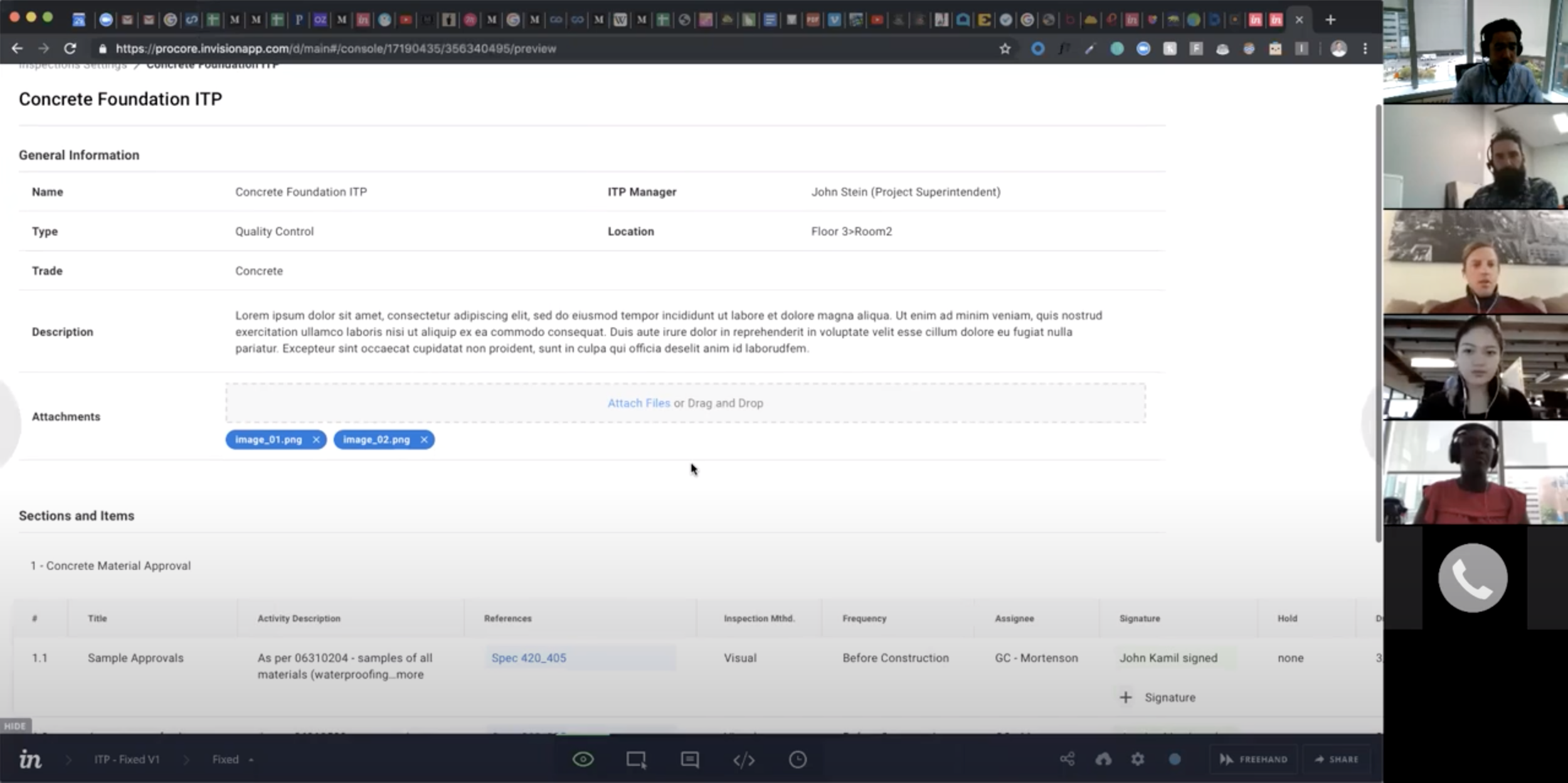
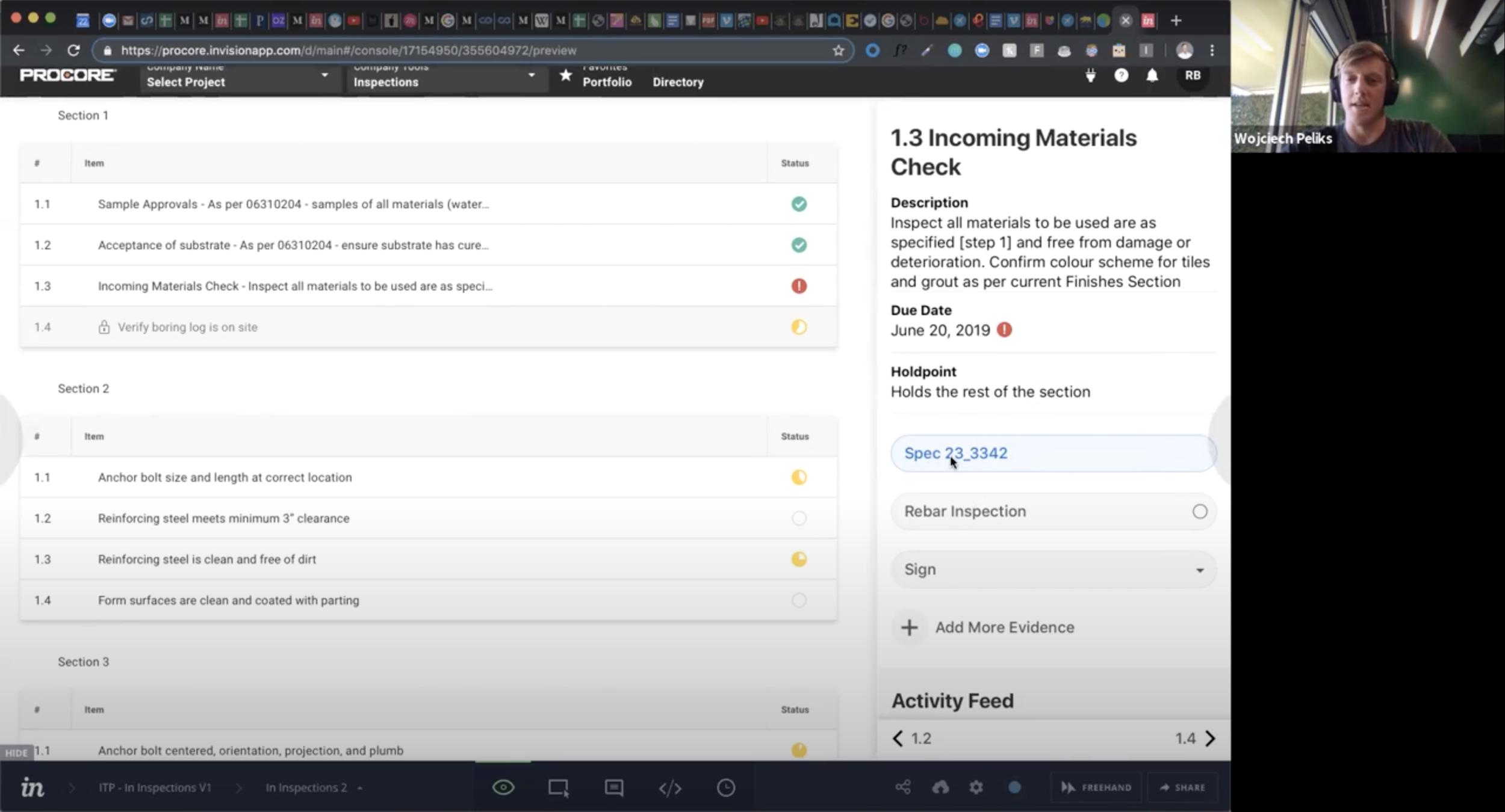
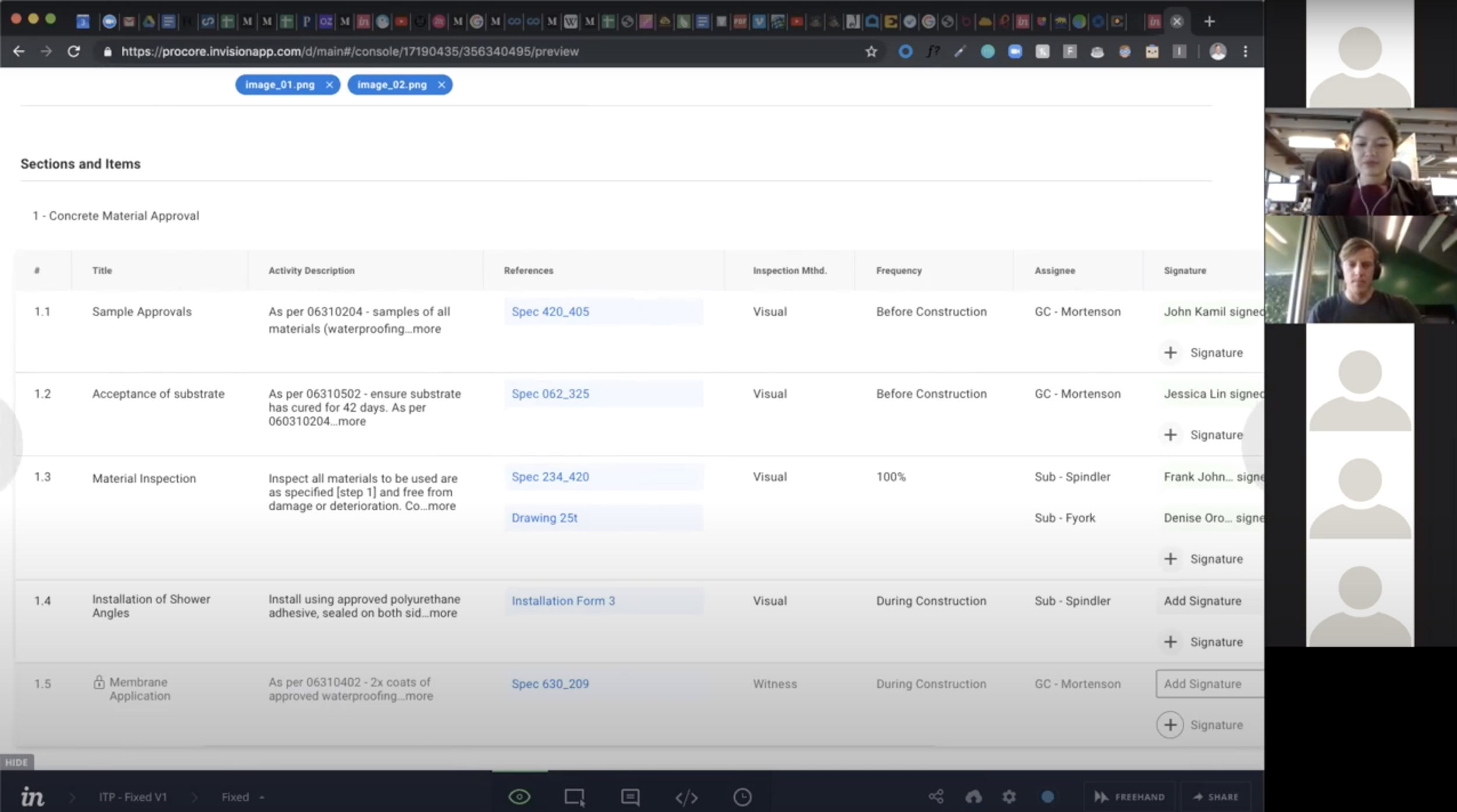
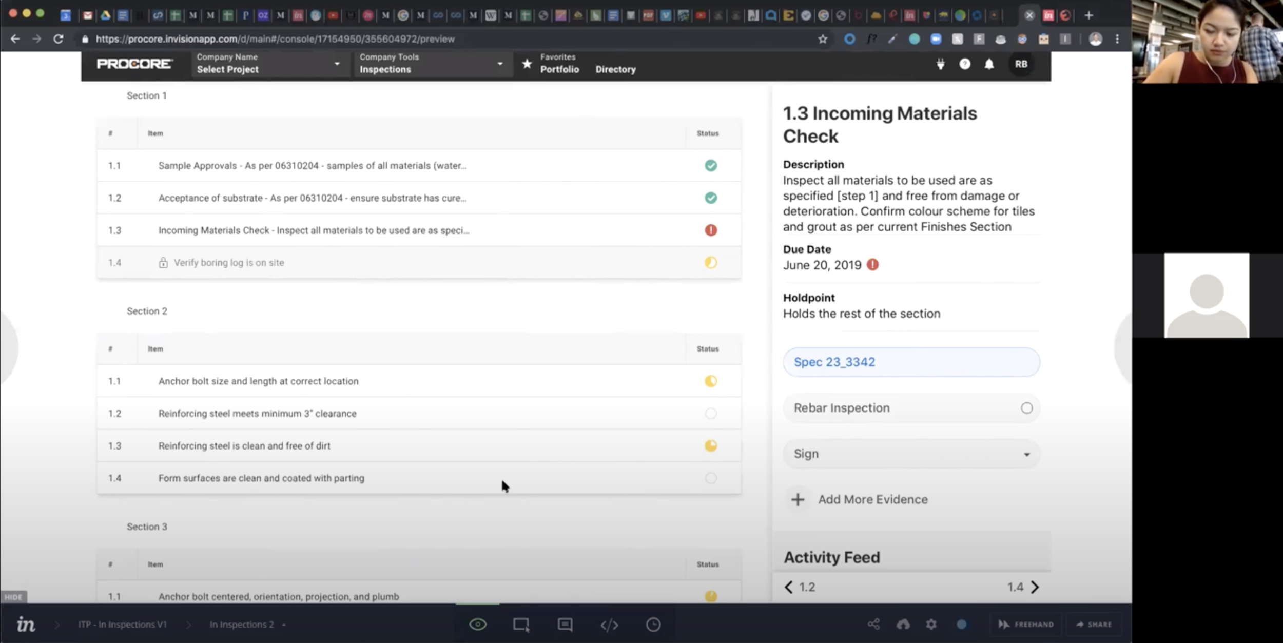
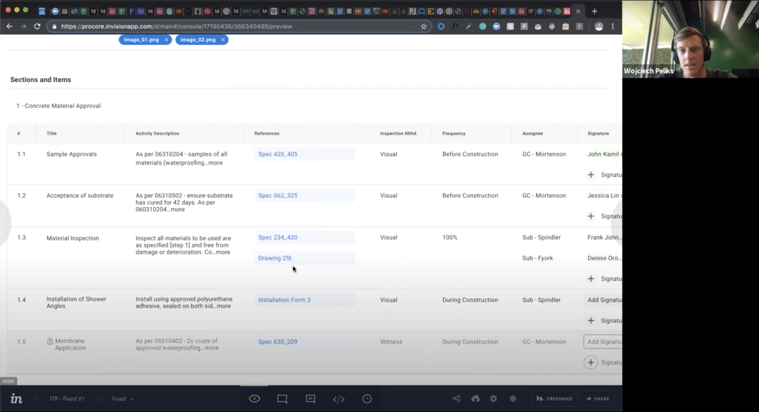
The validation was a success in terms of the first objective as all of the information I chose to capture was exactly what users needed. As to the layout preference there was almost a 50/50 split. Digging deeper into the reasoning for this I realized that it came down to the different personas who would be using the tool.
For office managers it was important to have a holistic view of the ITP so as to take quick actions on items. However, those same office admins were afraid that such a view would be overwhelming for field workers.
For office managers it was important to have a holistic view of the ITP so as to take quick actions on items. However, those same office workers were afraid that such a view would be overwhelming for field laborers who are not as technologically savvy, as familiar with the Procore platform, and only tend to focus on one item of work at a time. Based on this insight I decided to adapt both views into a web and mobile version. The web was optimized for the power user in the office, and the mobile view became simplified for the worker on the construction site.
Based on the testing feedback I:
Got rid of columns that did not seem as critical to the ITP process and instead provided a way to create additional custom columns.
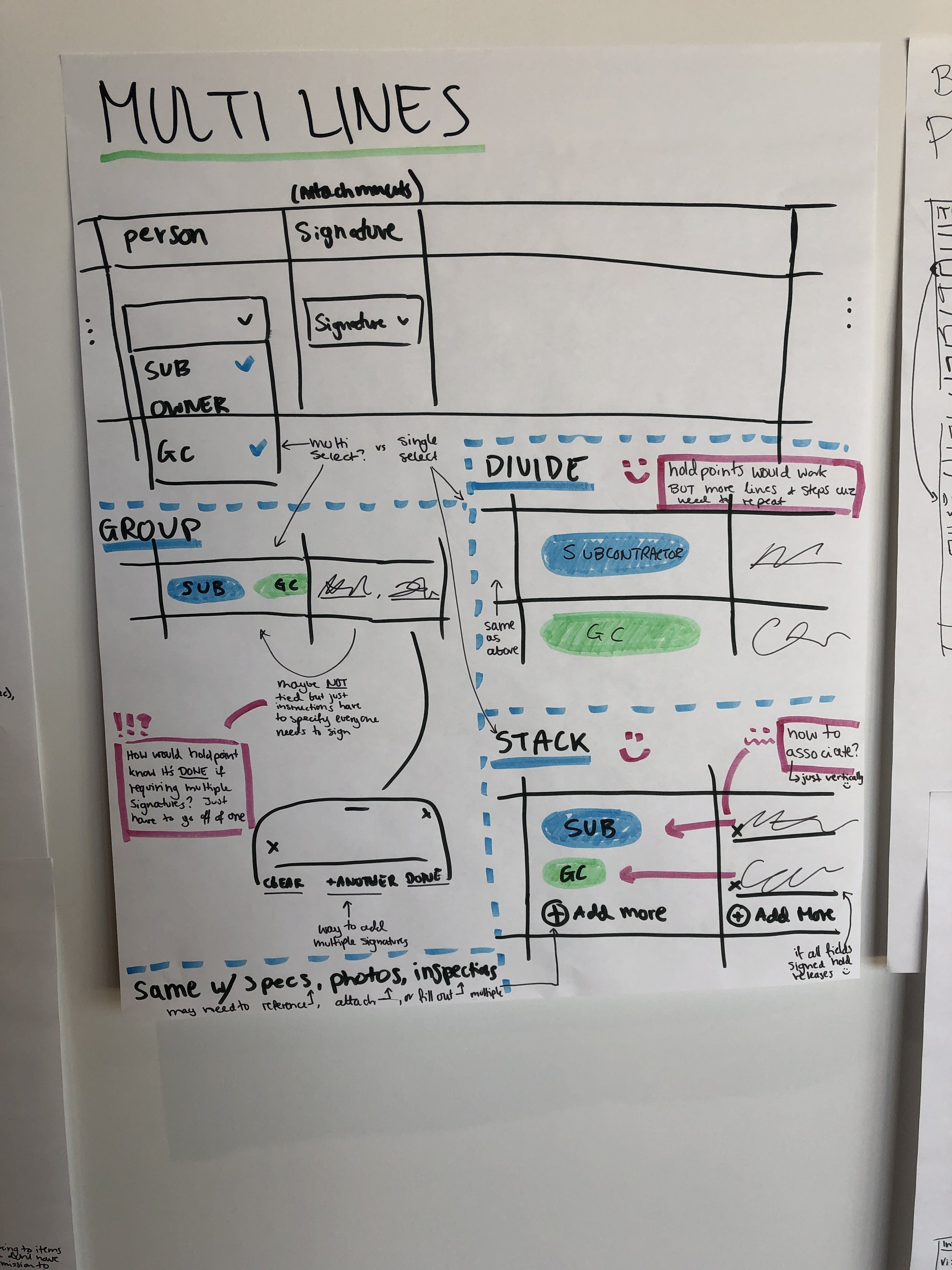
Combined assignee, signature columns and came up with a modal iteration for adding additional assignees.
Created a simple mobile version for the field so that ITPs could still be performed on the go.
Worked with the UI team to use most up to date system components
Testing Phase 2
With these changes I felt much better about the viability of my designs and I decided to test them again, this time as a prototype. A lot of companies were interested and I ended up testing with over 30 Procore clients from Australia, New Zealand, England, Canada, and the US. I wanted to verify that the ITP creation workflow made sense, whether the fields I retracted were missed, and to find out which Procore tools were most important to attach to the ITP as References and Records.
The prototype tested extremely well and the ITP tool was very well received and understood. That allowed me to dig deeper into the needs of our users and surface additional information about reporting, notifications, signatures, and other essential functions.
The columns I decided to omit for the MVP were not missed and users were happy with the proposed solution to add customizable columns down the line.
I was able to determine the absolutely most important Procore tools to link to ITPs.
Users needed a way to at the very least export a PDF of the entire ITP for handover to the owner.
Templates also tested very well as users expressed a need to easily build and replicate ITPs on projects.
‘Progress of the ITP’ was a highly demanded reporting functionality, and users loved the idea of a progress bar that was quickly scannable.
Project admins also wanted a glanceable status field to quickly get an idea of where the project may be stuck.
Notifications were important for the plan manager and users assigned to the plan so that they would know when a portion of the work was ready for their inspection.
Signatures had to allow for parties outside of the Procore system to sign as the inspectors would often be government representatives without Procore account access.
The tool was also rebranded to ‘Action Plans’ to accommodate more use cases beyond the Inspection and Test Plan needs.
The second round of testing allowed me to feel very confident in the design of the tool. It also allowed me to dive deeper into some of the continuing work that would follow the MVP release. I was able to use a lot of my new learned knowledge in figuring out the ins and outs of how the new tool would fit into the greater Procore system. Tool permissions, notifications, reporting, and exports are common features across all of Procore, and knowing the needs and the user personas behind these features in respect to the ITPs process further informed my design decisions.
I also further refined the mobile experience and began designing out all of the necessary features on iOS and Android. I wanted to make sure that workers in the field could fill out ITPs on the go. However, I learned that many of the jobs were rushed and sometimes edits and details had to be filled out after the “in-the-field walkthrough”. Thus, I made all of the necessary features for performing an ITP present on web and mobile, so workers could go back to the office after their shift and quickly make the necessary edits.
A fully functional tool in the Procore ecosystem of applications needs many settings and backend features. Feeling confident in the intended design and functionality of the ITP solution I got to work designing out all of the settings, recycle bin, company level, permission, export, change history, and notification solutions. Most of these pages had standards, but the real work came in working with the corresponding teams and making sure that we could successfully integrate ITPs to fulfill user needs.
The first thing I tackled was working with our exports team to design PDFs that would fulfill the needs around ITPs. Exported ITPs can be 100s of pages long, but they also need to contain all of the information for the owner. The links within the PDF allowed me to cut down the size of the export by letting a user to export the attached files separately.
There are many more users on a job site than there are permission levels in Procore. Thus, calling out granular permissions allowed the necessary individuals the access to perform needed functions, without compromising access to other areas of the app.
Not all parties need nor want to be notified of every ITP event. A notification matrix allows users the flexibility to set up their own notification preferences
Development
Because of Procore’s focus on international expansion the ITPs project was given greater priority, but also asked to meet a tighter deadline. In order to ensure a successful and faster release, my PM and I scaled back the MVP designs into a Beta from which we could learn and build upon.
I created an entire Acceptance Criteria document for our engineering team to answer any questions as to the function of all components. I set up a series of meetings to go over each section of the document as it related to the functionality we were focused on building, and answer any questions beforehand. This worked well to align everyone as to the intent and functionality of ITPs’ various parts. Grooming each section ahead of building significantly cut down our development time and eliminated backtracking during the building phase.
My PM and I also worked to create dashboards to measure usage and adoption. We regularly presented to key stakeholders about the progress, opportunity, and risks of the project, and we worked closely with the Sales and Marketing teams throughout the process to generate interest and excitement about the product. Upon launch we created a means of sales deal attribution that would allow us to know how much revenue our product generated.
Procore also held its annual construction conference in October where I was further able to validate my designs and validate demand for a quality plan solution in the construction industry. Since ITPs are more common internationally I was very happily surprised to hear so many US clients inquiring about the product and telling me that their companies were focusing on developing improved quality standards, for which this tool is designed.
Luisa, my PM, getting feedback from construction professionals at the Procore Groundbreak conference.
Design Patent
Since the software solution for ITPs was unique and never done before, and there were no other tools solving for this problem on the market, we were able to file a patent around the solution I designed.
Project Updates
April 6, 2020 — Beta with 25 companies from AUS, CAN, UK, & US
Jul 13, 2020 — MVP launch with 879 companies joining by of Aug 27, 2020
March 2021 — General Availability, product available for sales
Dec 2021 — $10MM ARR reached in under a year
Jan 2022 — Product “exceeds adoption expectations” as called out by SVP of Product and becomes a main pillar of ongoing global strategy
Early Sales Quotes
🇺🇸 “This is exactly what we need. This is the holy grail. This is spot on for how we should be doing work.” - KAES, US Construction Owner
🇨🇦 “I have been fighting with ITPs for years. We need this… It’s going to push every single party to do their job.” - Smith Brothers & Wilson, Canada General Contractor
🇳🇿 “We have been waiting for this for a long time!” - FCC, New Zealand General Contractor
🇦🇺 “We wanted something that is a one-stop shop which is why we are with Procore.” - NGR, Australia Specialty Contractor


