Gifton
UI and UX design for a social sharing site

Client: Gifton Time: 3 weeks Role: UX, UI, IxD Software: Sketch, InVision
Gifton
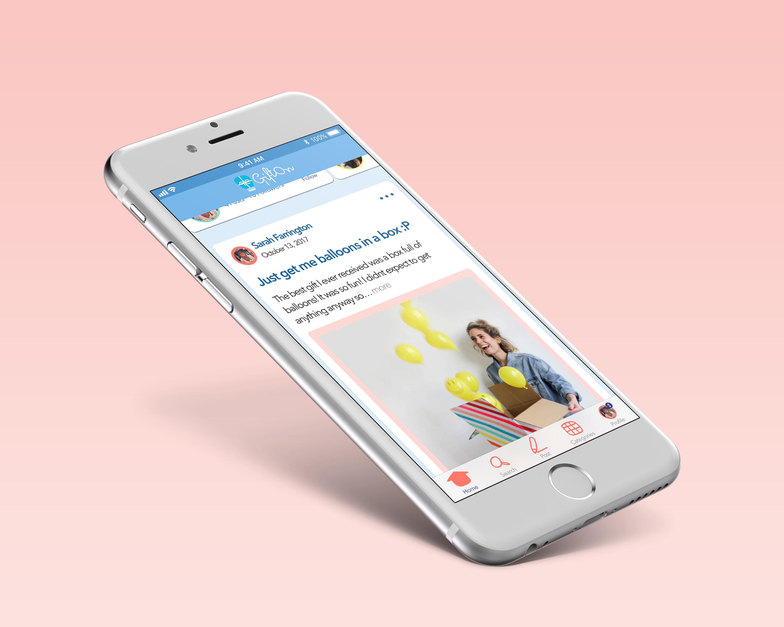
Gifton is a women-oriented social website for gift ideas. They allow people to easily find inspiration through user stories and make the gift-giving experience more meaningful and enjoyable. Gifton previously worked with both Designation’s UX and UI teams to improve their product, but they still felt that the interface lacked the necessary level of aesthetic. The product needed to compete for user attention in the sphere of giants like Pinterest, Instagram, and Facebook, and needed to look just as professional and captivating. Thus, Gifton asked our team of designers to reimagine the interface of the product, focusing on a mobile experience. Our team of four designers collaborated on competitive research and user testing, but each of us delivered unique high-fidelity mockups, a full prototype, and a style guide to the client.
The Challenge
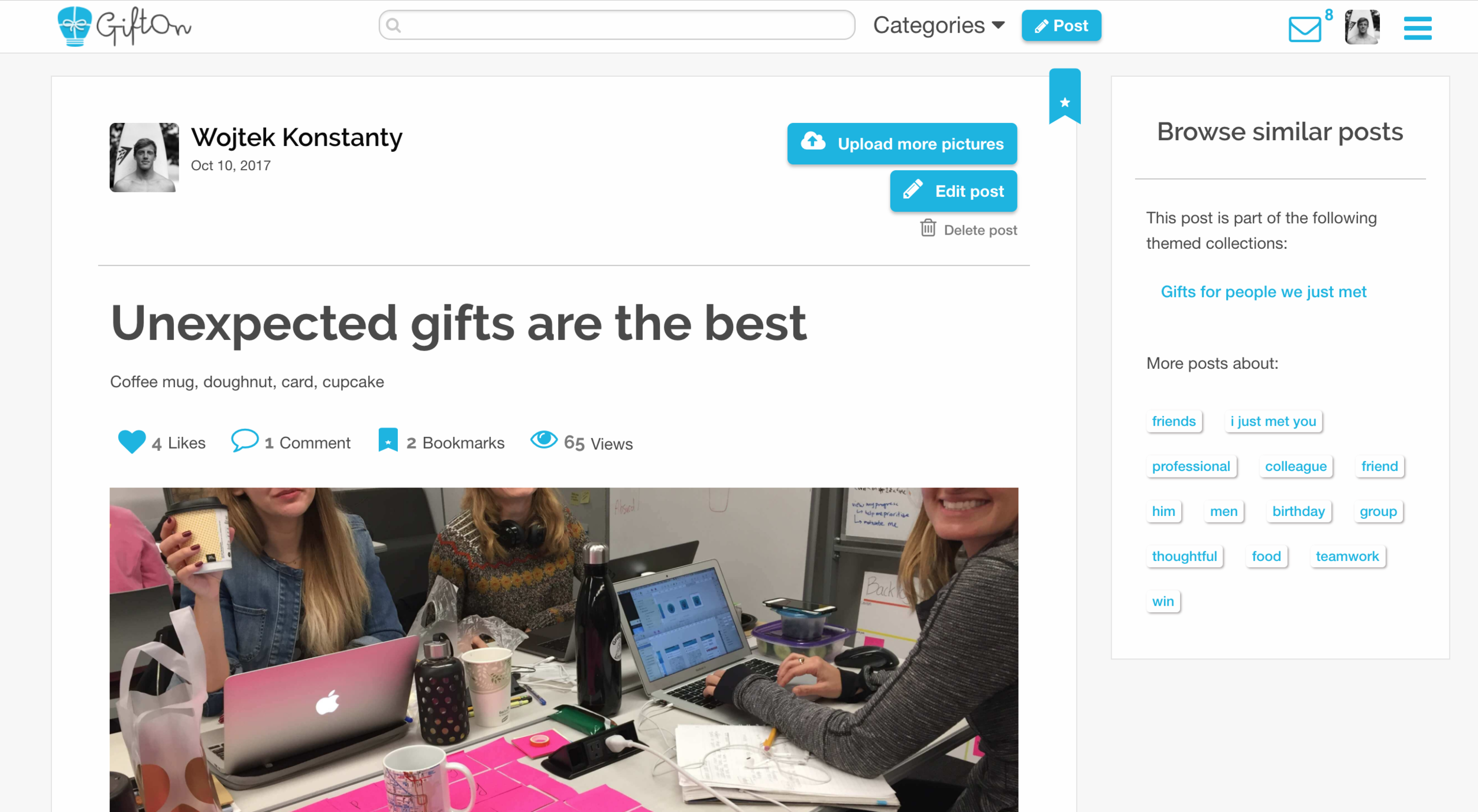
As a male designer, I was excited about the opportunity to learn more about designing for a women-oriented digital product and I was eager to find out how my aesthetic would translate for this audience. Gifton also wanted our designs to focus primarily on a mobile experience and I was interested in rethinking their design from a mobile-first point of view. I began my process by familiarizing myself with the current site. Browsing through other people’s gifting stories I decided to sign up and post my own story in order to better understand the product flow and identify potential areas of improvement. Some design elements that immediately stood out to me were:
- The variety of fonts used
- The bleakness created by the grey background
- The inconsistent and excessive spacing
- And the stock photos in many of the posts
I was excited to start working on some of these areas and help improve the usability and aesthetic of the site. First, however, I wanted to gain a greater understanding of how Gifton envisioned their brand. Our team prepared for the initial client meeting by putting together a deck in which we included a quick visual test for Gifton. We wanted to gage their reactions to a set of other websites so as to better discern Gifton’s desired direction for the brand. Through the test and following discussion we learned that Gifton envisioned designs that were:
- Fun; Colorful, but not too bright; Organic; and Imperfect
- Gifton wanted users to feel that posting was extremely easy and posts did not have to be curated or as detailed as a blog entry
- They wanted the content to feel very personal and inspire a sense of community around the gifting experience
A few other key learnings we took away from the meeting were that:
- The intended audience was predominantly women, similar to Pinterest’s users
- The design should focus on the story in the post instead of the image
- Gifton wanted to push the user experience toward mobile-first interactions
- Colors were not set in stone and blue was previously used because it was more gender neutral
- The home page, a community spotlight of users, comments, and tags on posts were top priority features scheduled for release before the holidays
Gifton was open to exploring new visual directions and clearly communicated what they wanted their product to feel like. The primary goal of the redesign was to make the site enticing to new users and promote interactions that would build a strong community on the platform. After the meeting, I immediately began to brainstorm ideas of social and women-focused websites from which to draw inspiration. I was eager to create a design that evoked an easy-to-use social media feel, while bringing a distinguishing element of fun and playfulness to the product.
Defining the Path
As a team we felt that we got a very good sense of direction from Gifton and we decided to translate our meeting takeaways into guidelines for our designs. We knew Gifton envisioned a fun, effortless, and inspirational redesign and we refined these concepts into three design principles to guide our work.
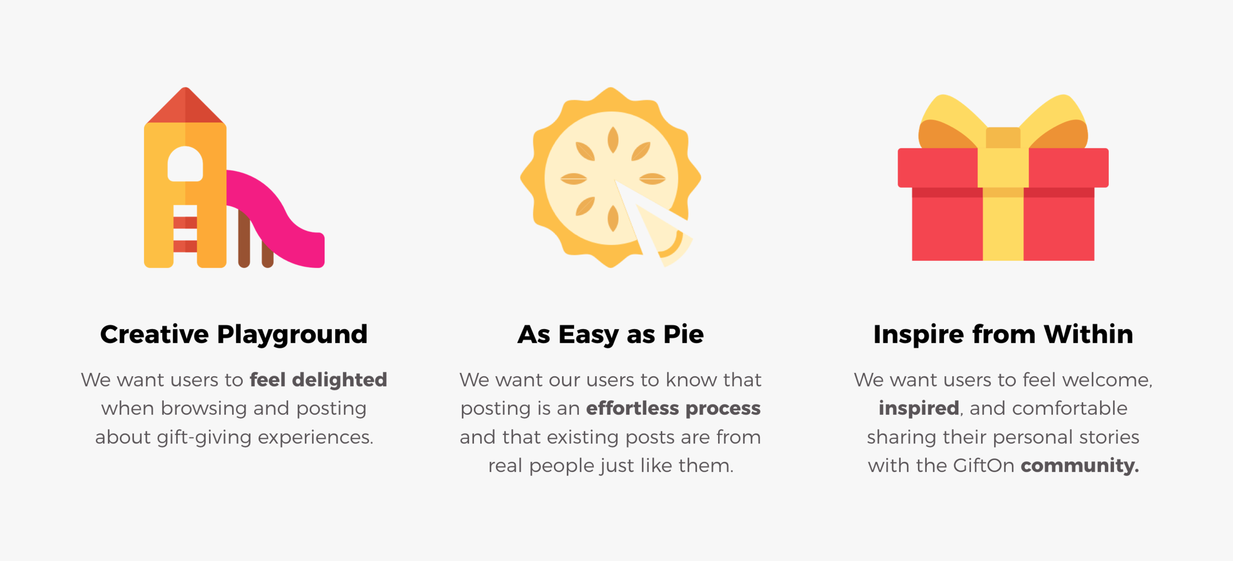
The Gifton team resonated with these design guidelines and felt they accurately outlined what they hoped the new designs would achieve. With a good understanding of what the Gifton team wanted we decided to draw inspiration from a wide array of websites. We looked at other gifting sites, women-focused brands, social media, e-commerce, and websites that brought elements of illustrative delight. We wanted to draw inspiration from what each of these sites was doing well and translate it into a visual language for Gifton. While we analyzed visual design areas such as typography, imagery, layout, and color, we also wanted to find websites that matched one or more of our design principles and identify the elements which brought feelings of fun, effortlessness, and community. Some of our findings were:
Fonts—Sans serif fonts felt more lightweight and less editorial
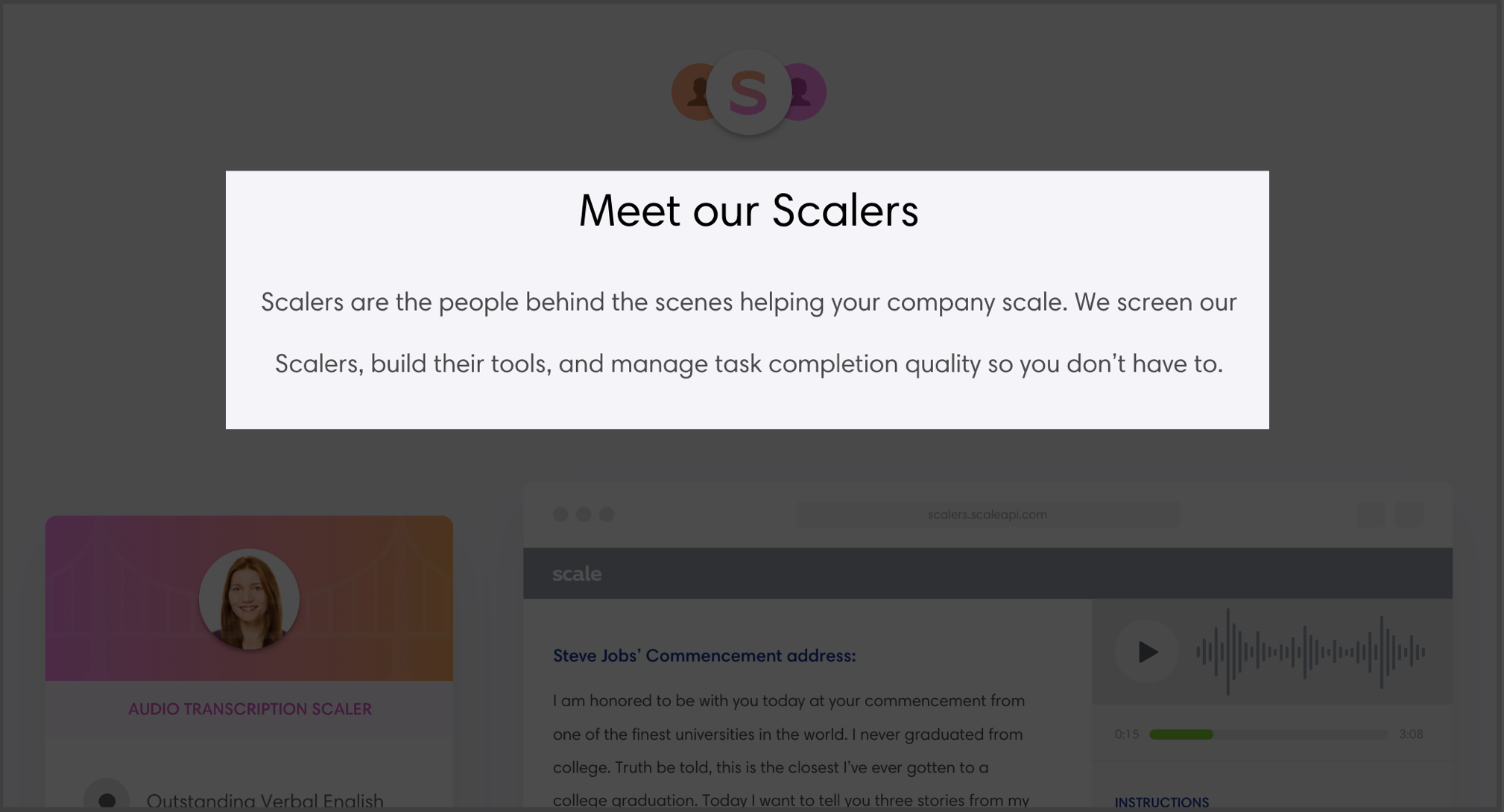
Fonts—Different weights for titles and body copy were more visually appealing

Fonts—Rounded fonts helped the site feel more fun, because they weren't as angular and harsh and brought in an element of softness and lightness
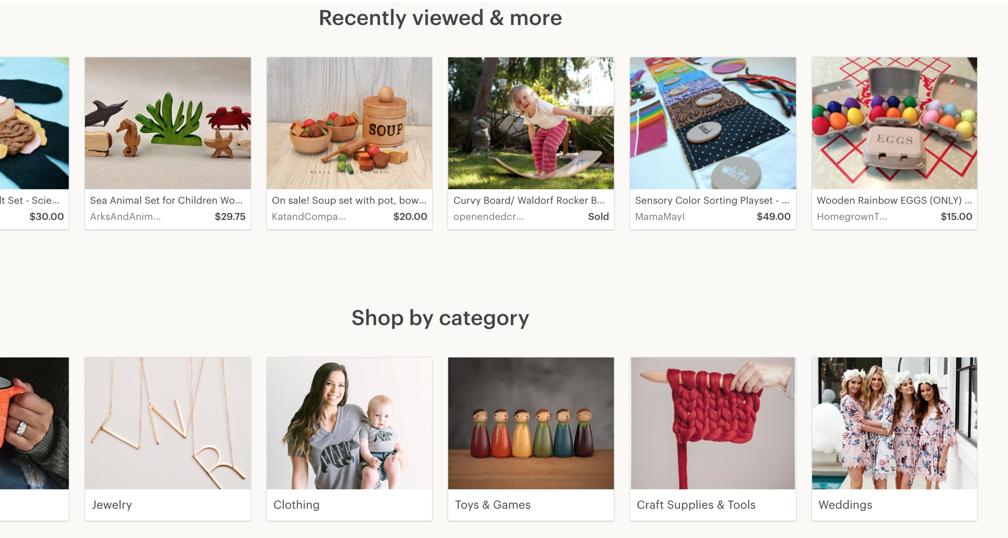
Images—High quality images helped engage users because images were often the first thing that a user saw
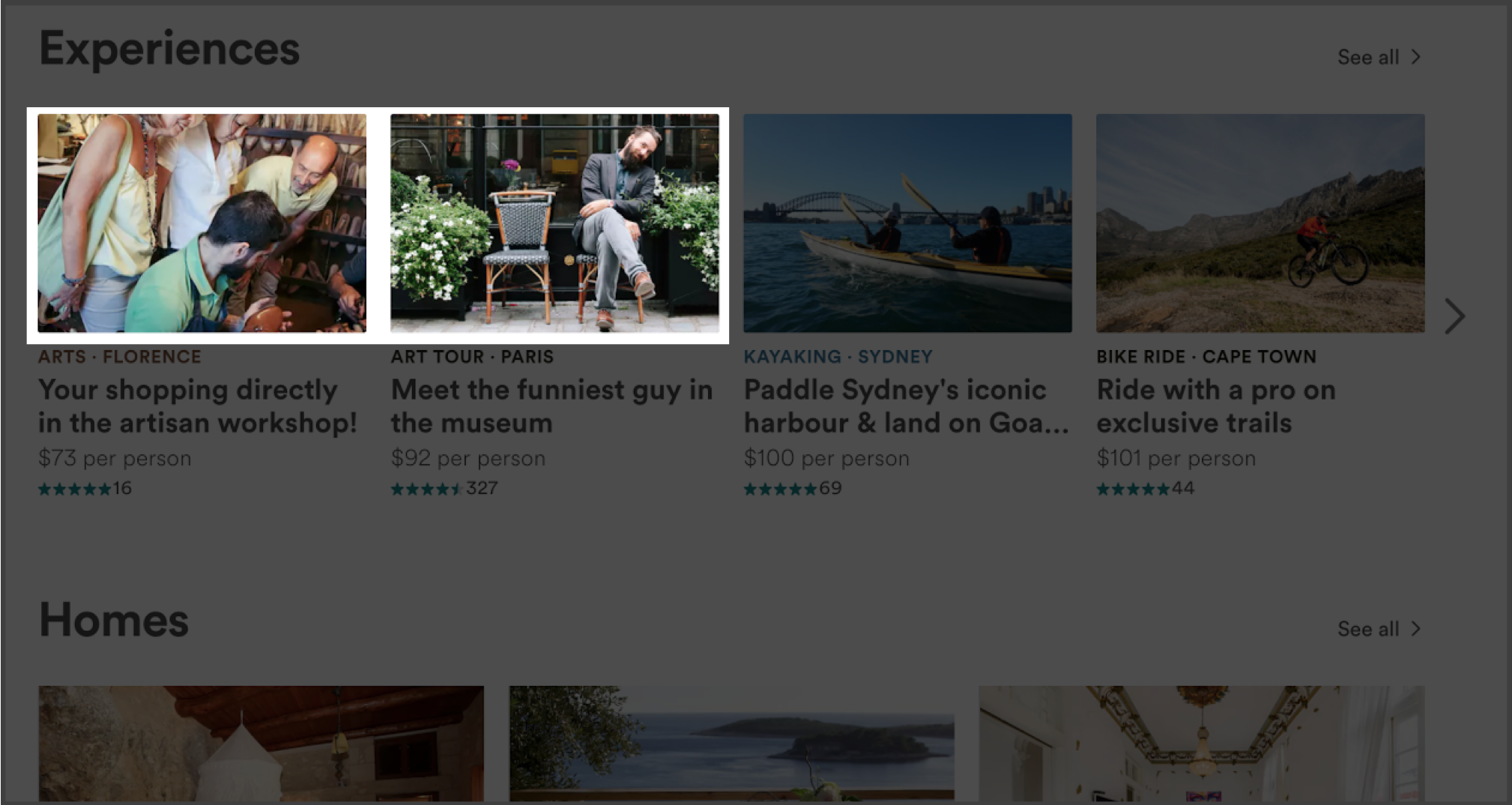
Images—Photos with real people's faces were more effective in drawing people in and made the entire experience more personal
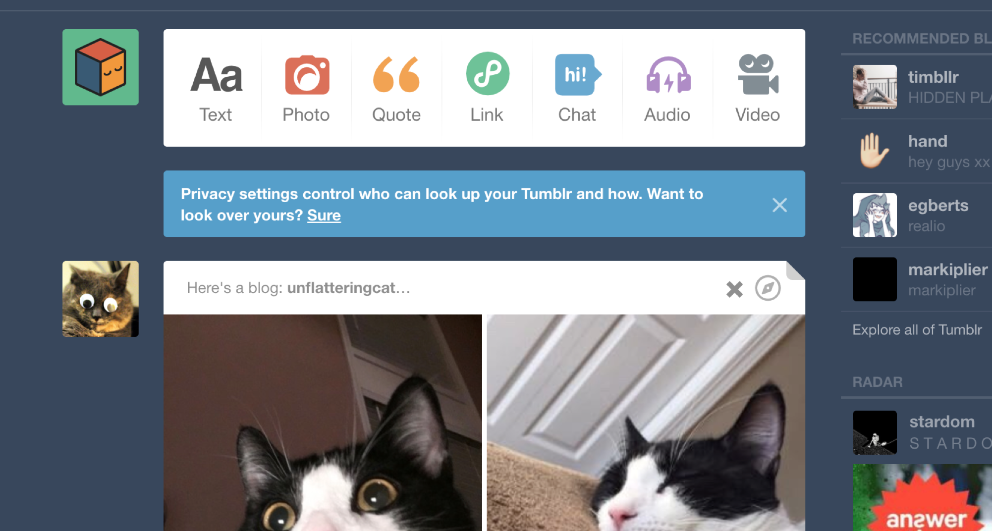
Layout—Most sites used vertical scroll to incentivize staying on the site
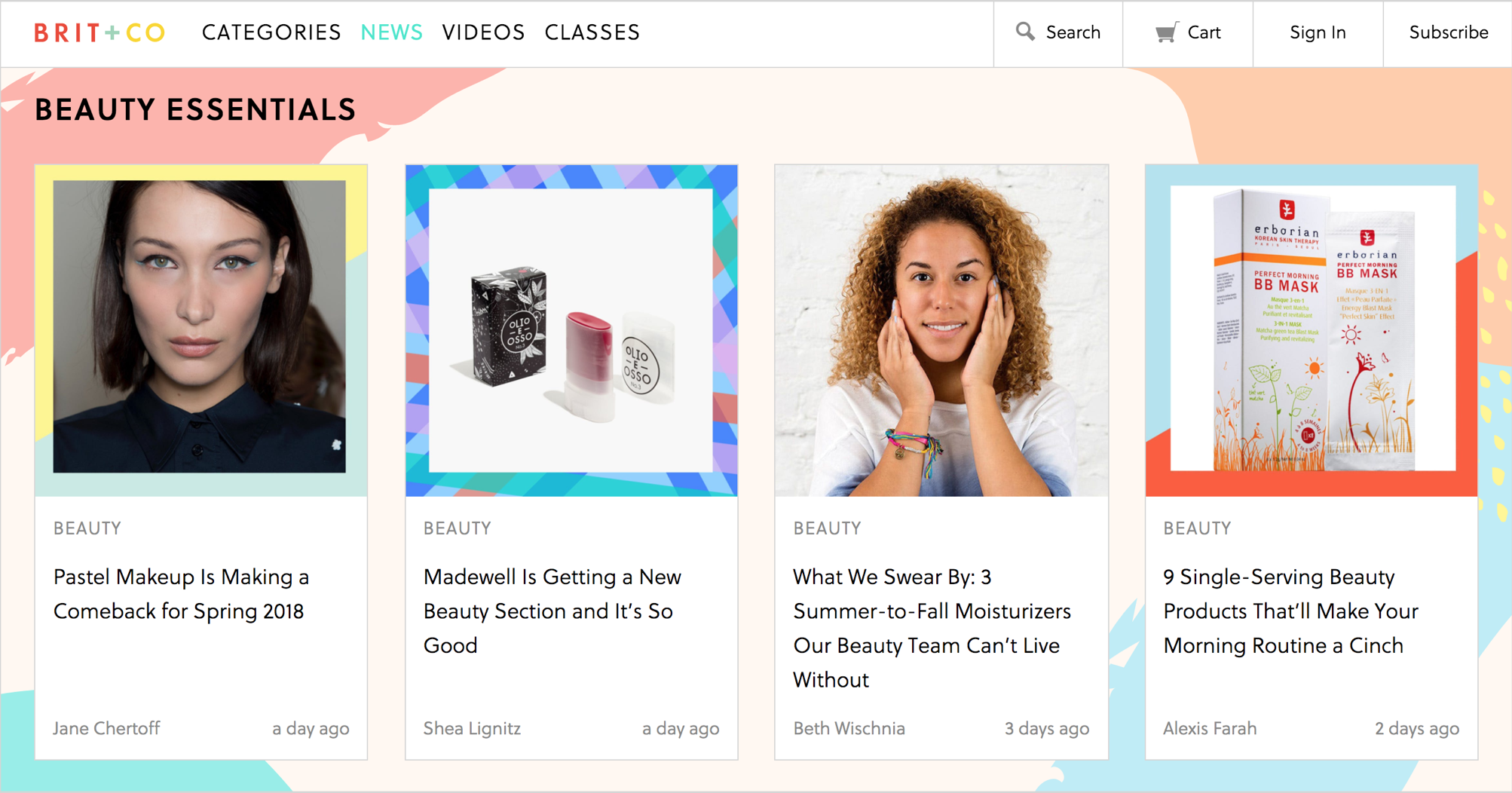
Colors—Pastel palettes appealed more to a women audience
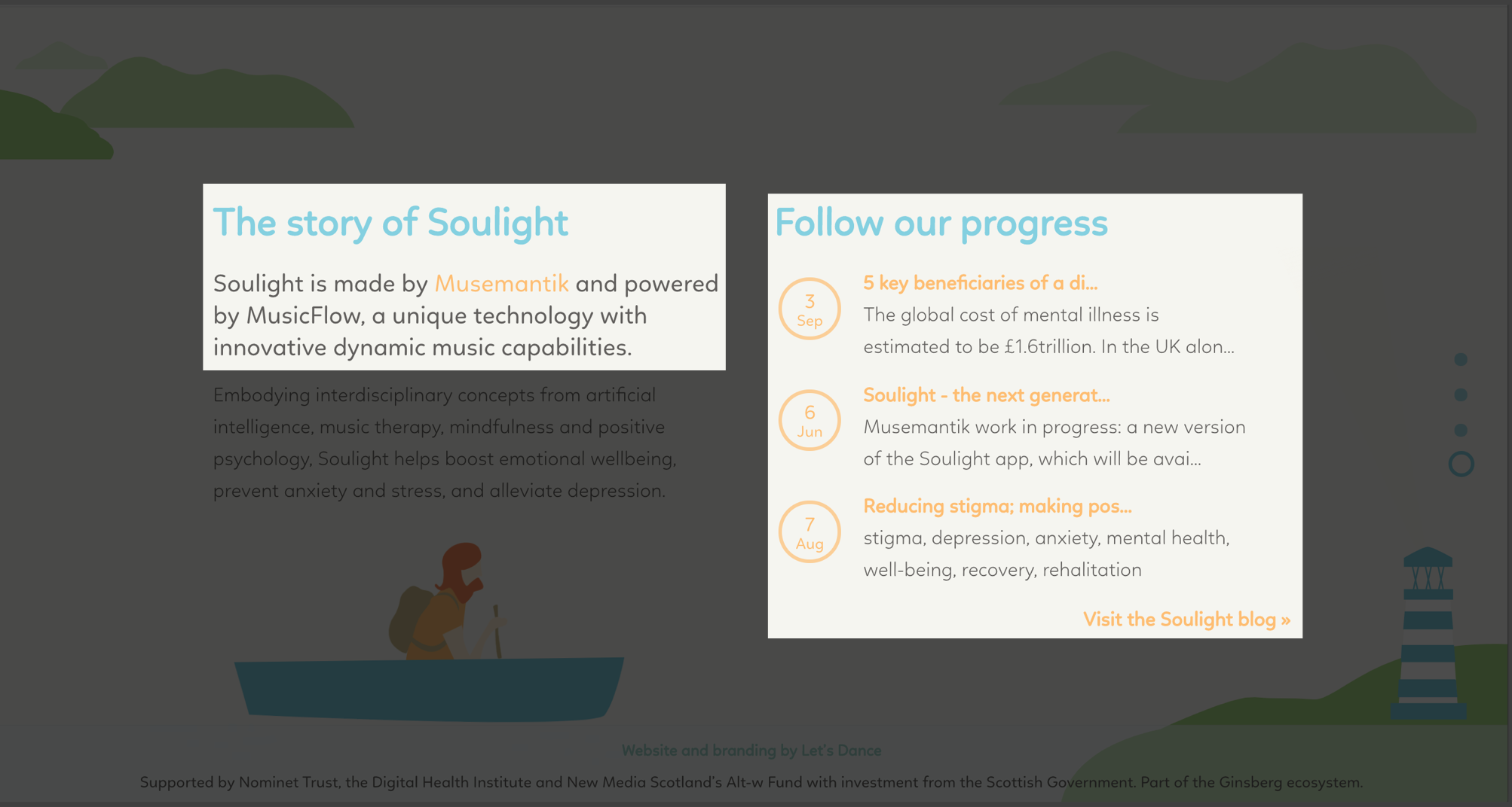
Colors—One or two highlight colors for calls to action kept the designs clean
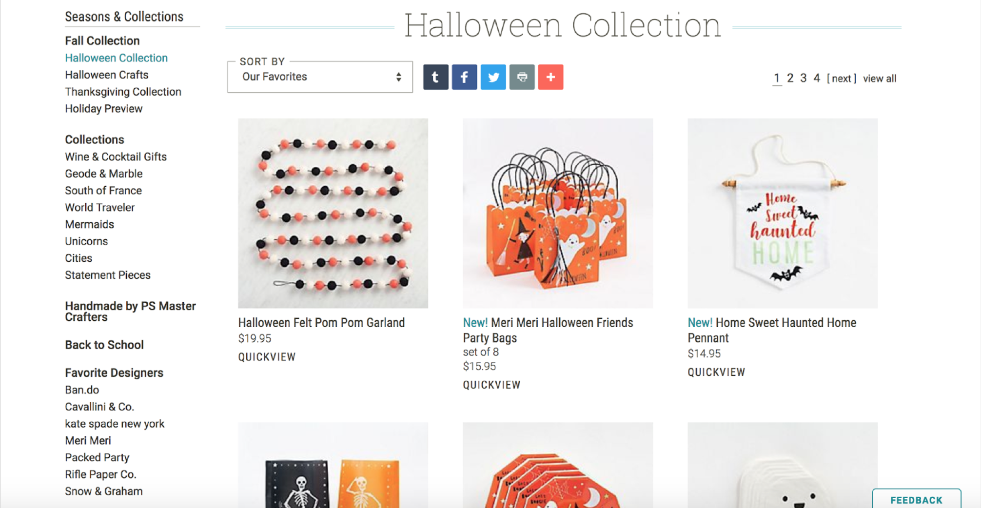
Colors—Mostly black fonts were used for readability against white backgrounds
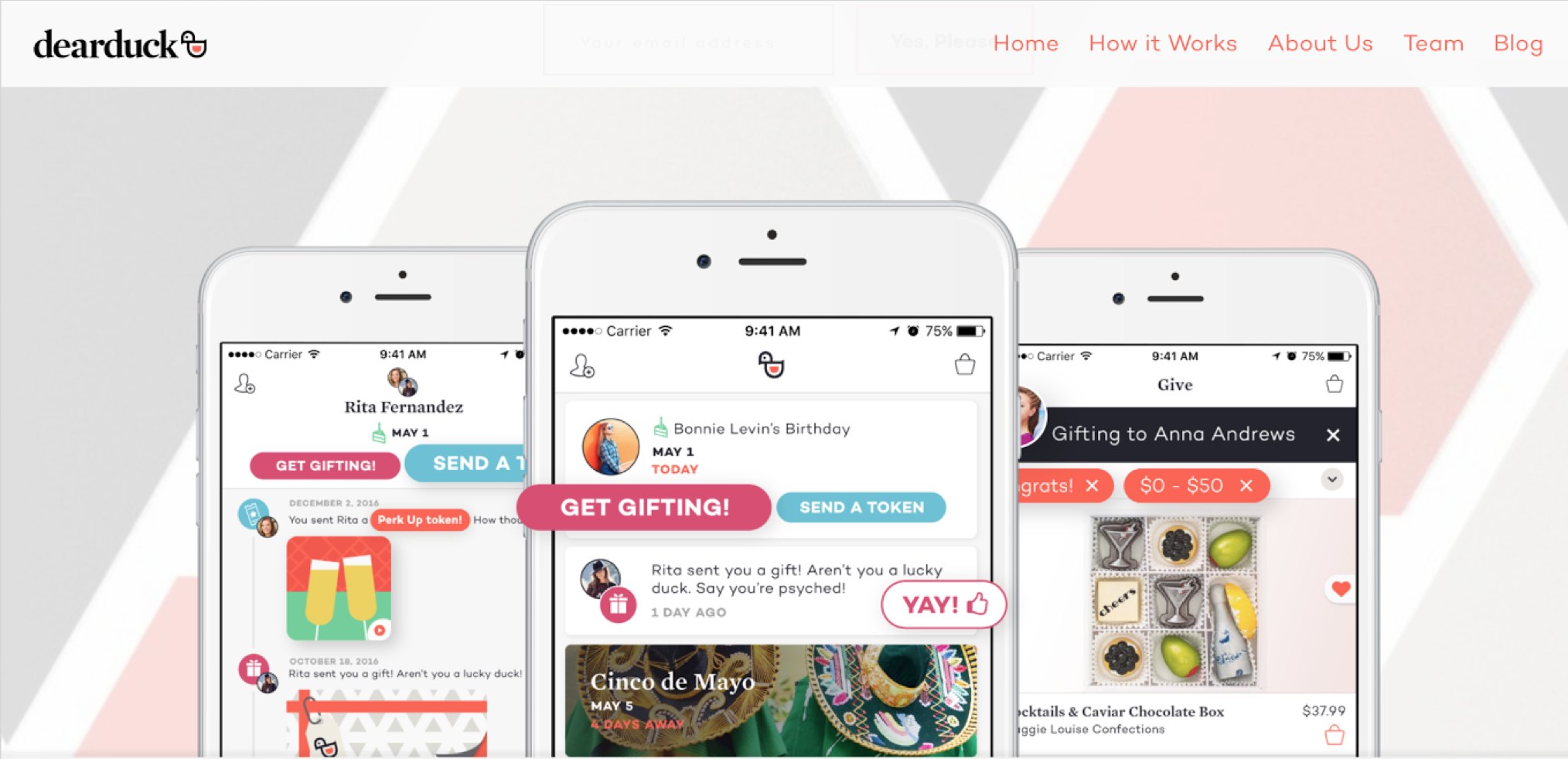
Fun—Mixes of tertiary colors felt more original and fun
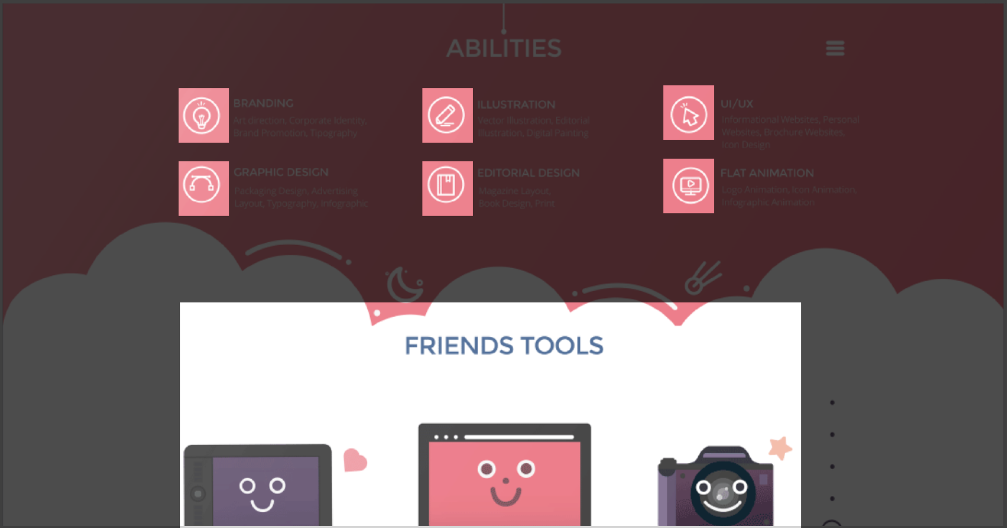
Fun—Rounded elements and shapes made the site feel less serious
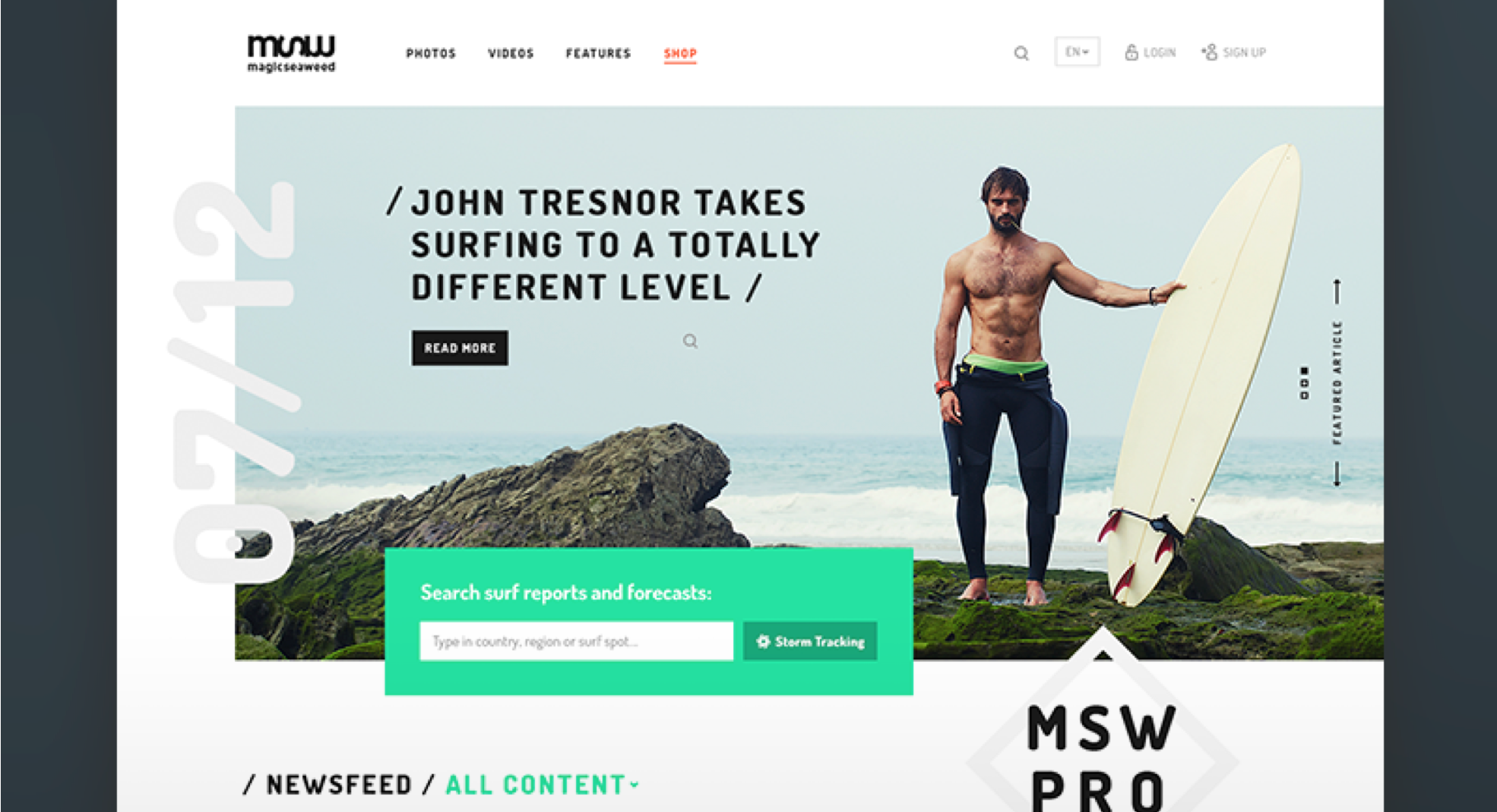
Fun—Elements of thoughtful disorganization created a more organic feeling
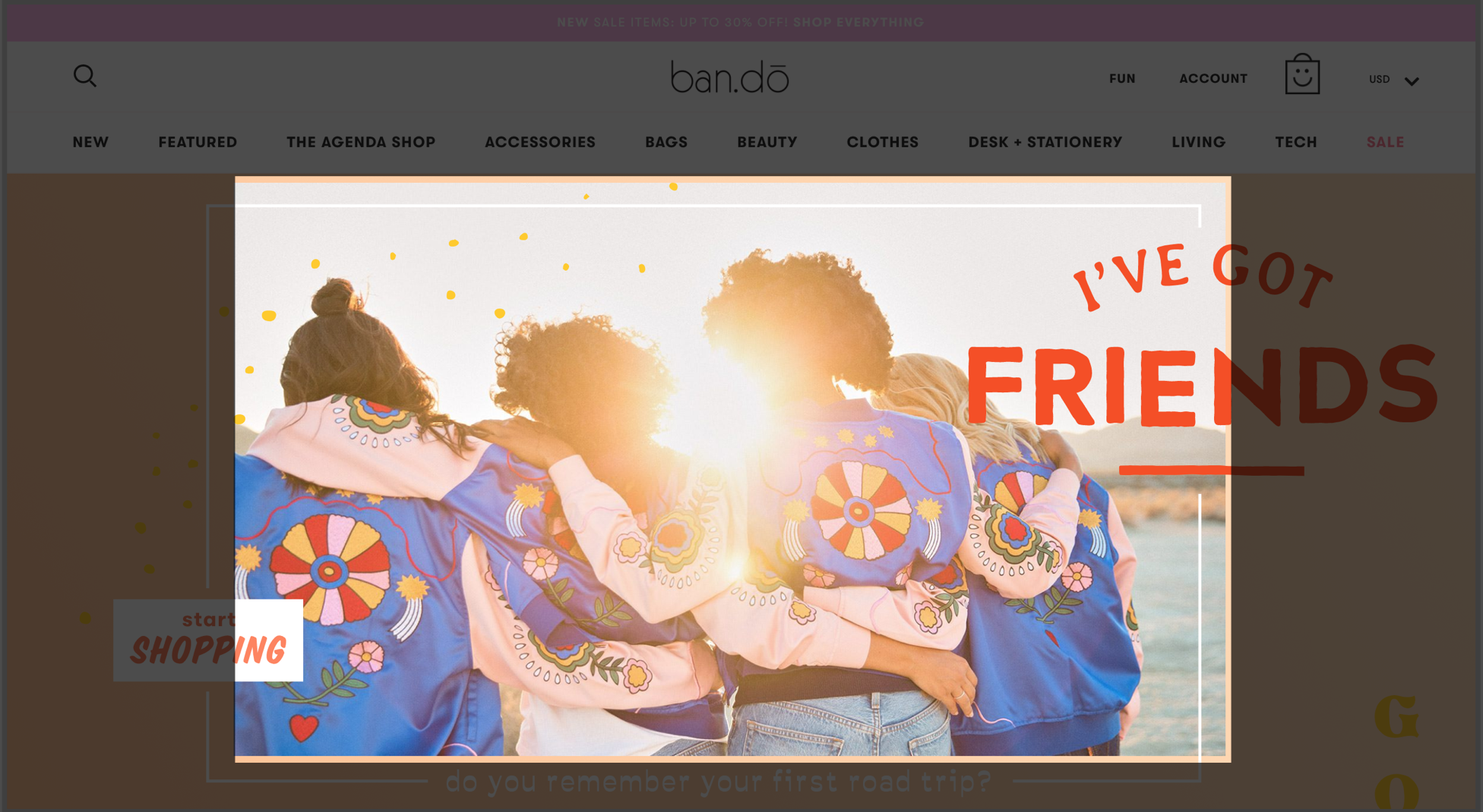
Community—Images of real people interacting made users feel a part of a human community
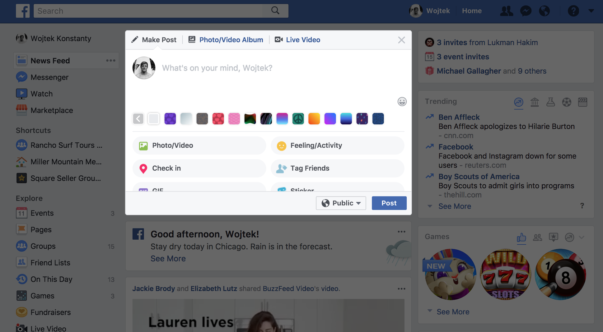
Effortless—Intuitive actions grouped in a single area promoted content creation
Our team distilled this analysis into three main visual takeaways to concretely build on the design principles we developed:
- Using wide sans serif fonts and vertical scrolling cards to create a feeling of ease
- Using high quality photos of people to draw the attention of users and make them feel a part of a community
- Creating a clean design with some organic elements and few highlight colors for calls to action.
As a group we decided that including these elements in our individual designs would strongly align our work with Gifton’s envisioned brand.
Design Exploration
With design principles to guide our work and a wide array of inspiration to draw on, we felt well equipped to begin our individual explorations for Gifton. I was personally inspired by the design principles our team developed and wanted my designs to directly reflect them. The fun aspect stood out to me particularly in a very illustrative and organic form and I was excited to try a very playful direction. I communicated my design ideas to Gifton in the form of three unique style tiles, each of which played up a certain guiding principle.
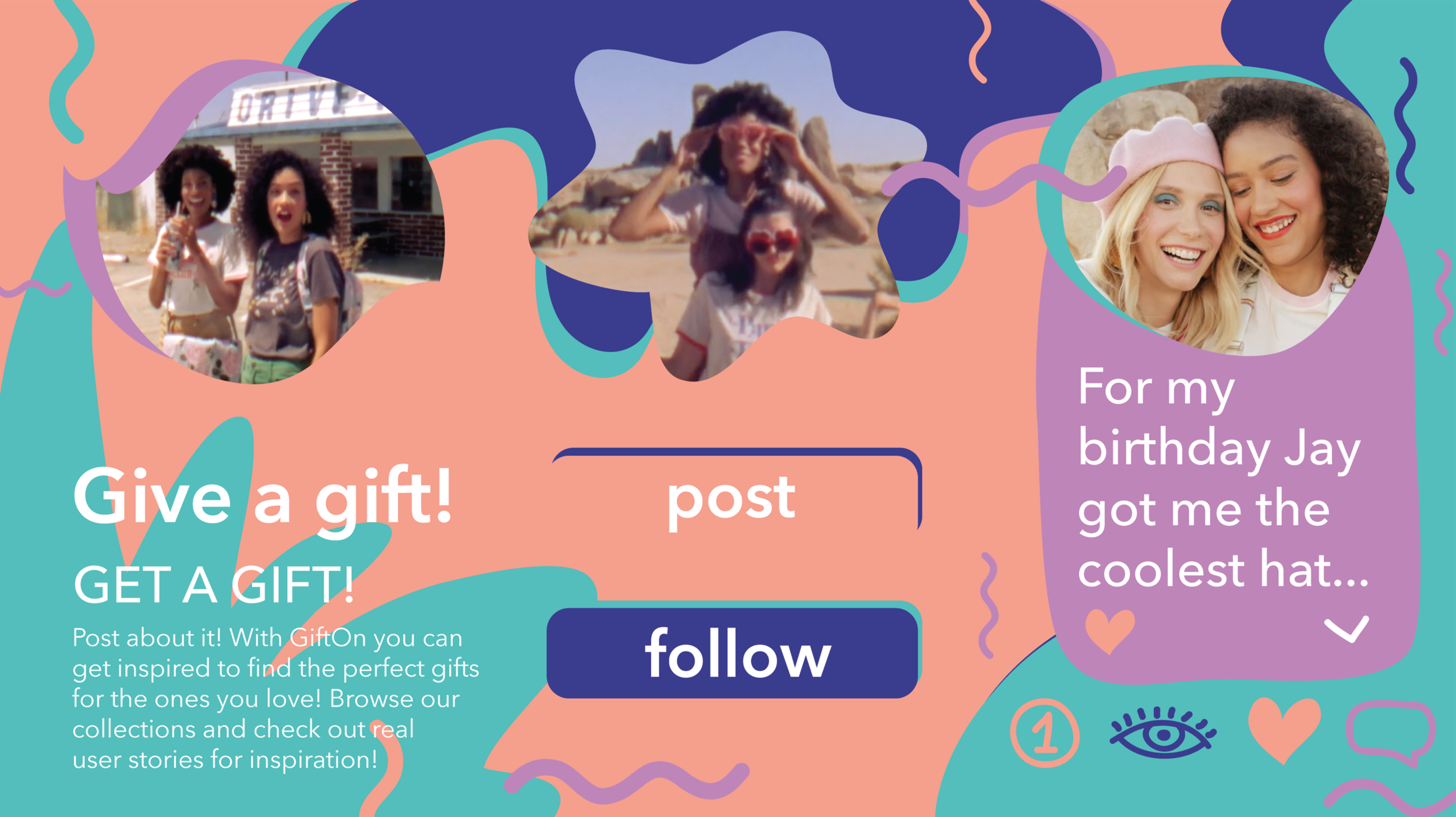
Play. In my first direction I really wanted to play up the fun principle through the use of hand drawn colorful elements, pastel colors, and organic shapes. I also created custom image masks which would delight the user and decrease the importance of uploading perfect photos.
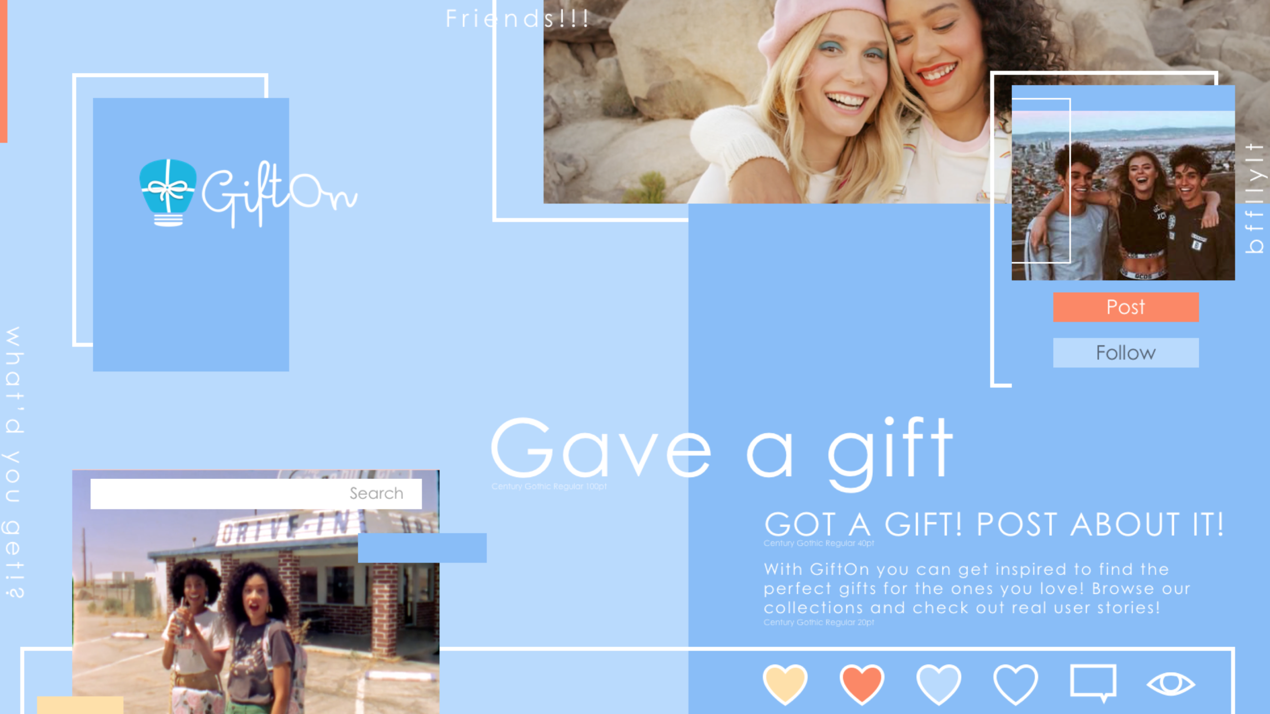
Effortless. In the second direction I wanted to create a more modern aesthetic with a lot of whitespace to create a sense rest and ease. The sharper shapes created more structure, but I wanted to bring in playfulness through their disorganized layout, letting the eye wonder around, discovering new areas.
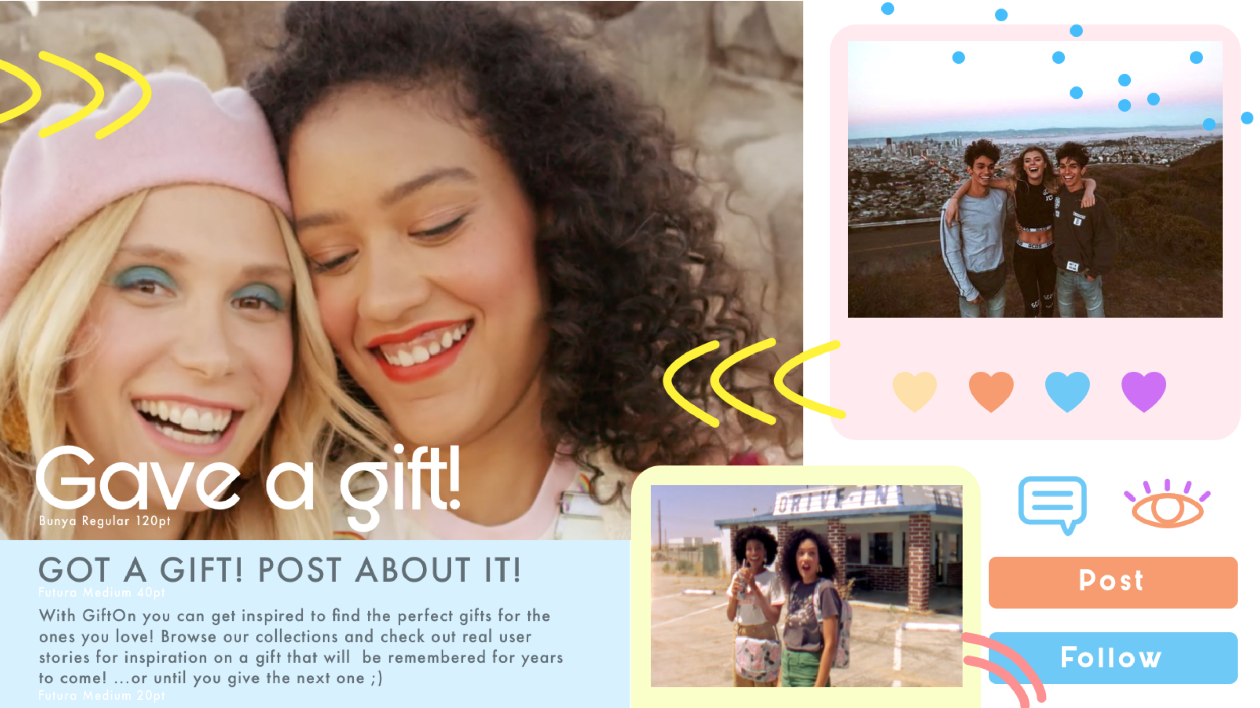
Community. In my third direction I drew upon the principle of community by bringing photography to the forefront, but stylizing it for users with colorful polaroid frames and overlaid illustrative elements. The rounded shapes and icons along with the pastel colors further cheered up the design.
The Gifton team loved the Play and Community style tiles, but resonated less with the Effortless design direction. They particularly liked how fun the organic hand drawn elements felt and thought that the treatment of photos through custom masks or frames would encourage their users to upload posts more freely. The polaroid look of the cards in the community design translated well into how quick and easy the Gifton brand should feel. The Gifton team also thought the Play style tile “knocked it out of the park” in capturing the playfulness of the brand and could see the illustrative background serving as a hero image for their site if the colors were more muted.
Designing a System
I was extremely happy that the Gifton team responded so well to my designs. Their openness and interest in the more adventurous Play style tile particularly intrigued me and I was excited to try designing a unique system for their brand. I realized that the hand drawn shapes and icons would pose a challenge, but I was eager to try developing them into a repeatable system that delighted and surprised users. I began my exploration with some rough sketches of potential layouts.

However, I quickly realized that with the limited space of a mobile screen I didn’t have a great grasp on how to arrange the text, images, and icons in the most effective way. I wanted the design to feel unique, but I also wanted to maximize efficiency and ease-of-use. Since Gifton wanted their site to feel social, I decided to learn more about the various design approaches from a few established platforms. Facebook, Instagram, and Twitter have optimized their specific layouts and I knew that I could gain a lot of insight into best practices by analyzing their designs. I opened the apps on my phone and sketched them out to better understand what elements to include and how to position them.


Through my sketches I found some interesting insights:
- All of the apps included a profile picture, name, content (image and/or text), and interactive icons within their posts
- The text was mostly limited to three lines with a (...more) button to expand the rest of the text
- The text on Facebook and Twitter appeared above the photo when a photo was included
- A profile picture and username always appeared at the top of the card
- Icons were grouped together and always appeared below the content
I decided that applying these learnings would make my designs more intuitive for users as they’d be more reminiscent of very familiar apps. Going back to sketching, I brainstormed ideas of how to combine my insights and the organic shapes from my Play style tile into a mobile design for Gifton.
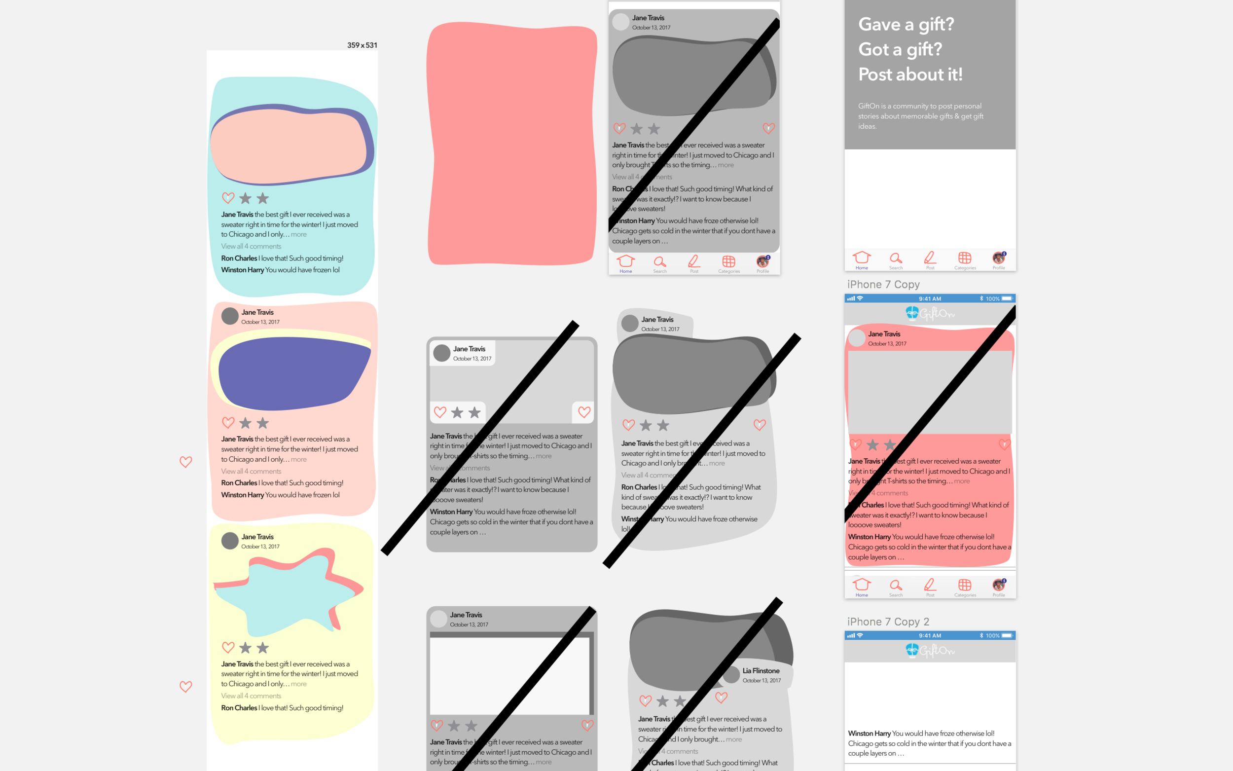
Through several quick mockups I also realized that the organic shapes I envisioned were not very efficient in utilizing the limited space of a mobile screen. They also didn’t look as good as I hoped. Instead, I simplified them into rounded rectangles that maximized the space for text, photos, and icons. This layout also most closely resembled the layout of social media apps that users would be familiar with and I hoped that this familiarity would translate into a greater desire to interact with the Gifton site.
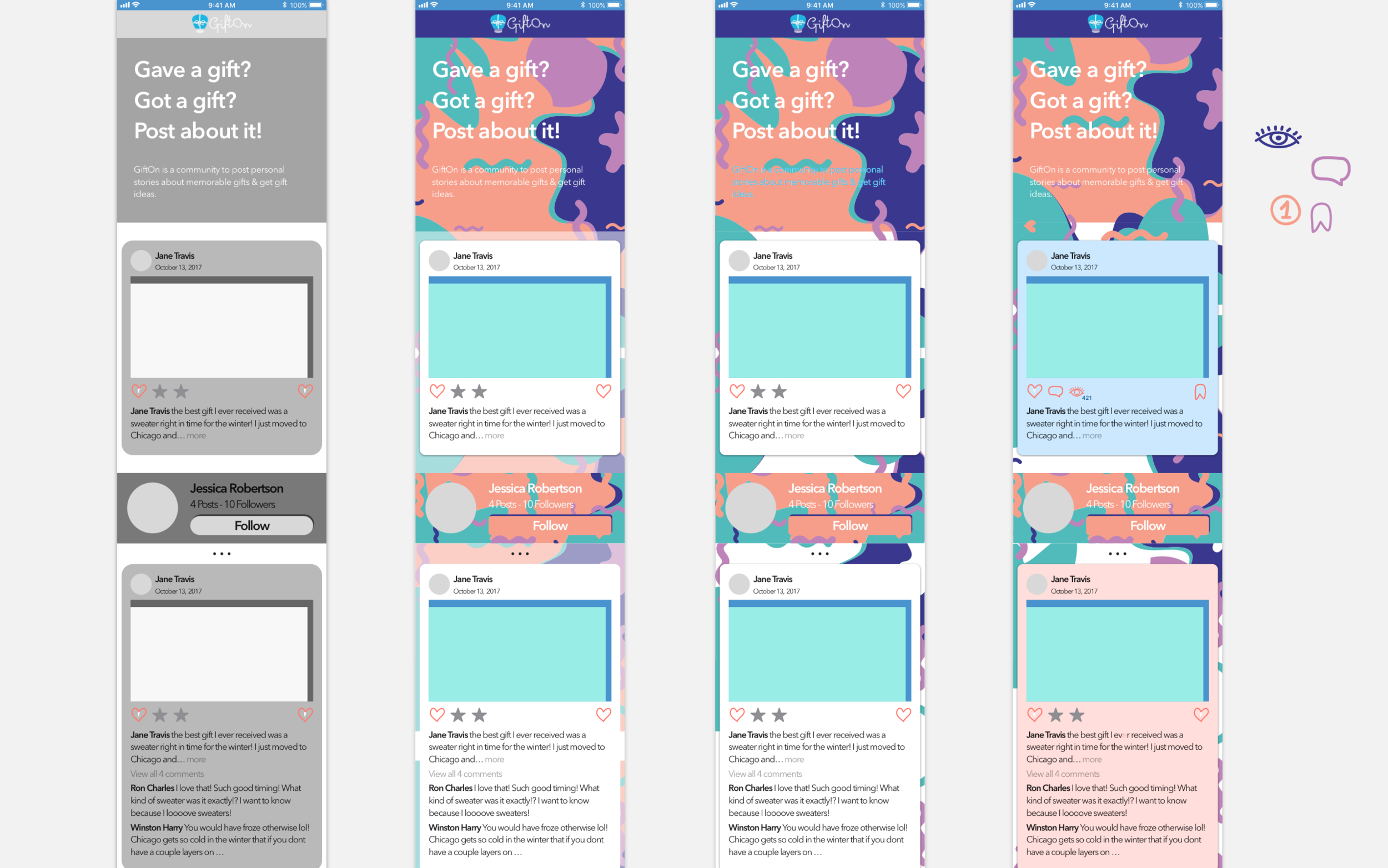
I was getting to a happy spot with the layout of the cards, but the colors from my Fun style tile felt very heavy and overwhelming. To lighten up the design I tried muting and removing certain background colors, but eventually I opted for redoing the color palette altogether. The new colors I chose better represented the lightness and ease which Gifton wanted to communicate, and were more gender neutral, while still skewing towards a women audience.
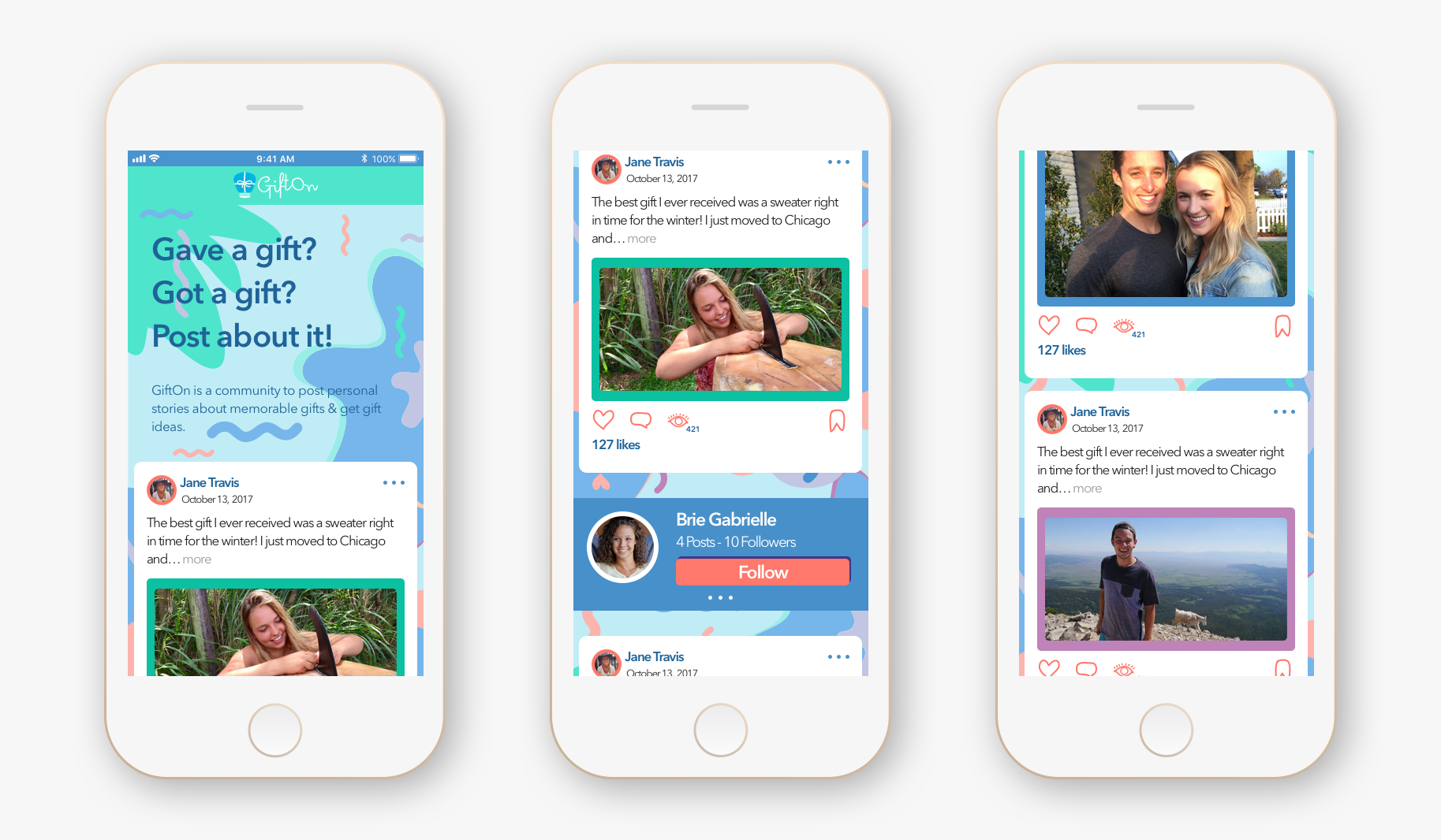
I also noticed that Facebook and Twitter, which were more text oriented apps, prioritized the text above the photo, while Instagram included text below photos. Likewise, I decided to move text in each post above the photo since Gifton wanted to focus on the gifting stories rather than images.
Moreover, I found that the main social apps served actual content right away to hook the user and incentivize them to keep exploring. Thus, I reorganized the wireframes slightly to showcase a real post immediately below the banner and moved the community spotlight and categories below actual user posts.
User Testing
With the design finally in a place I was happy with, I was eager to test it with real users. Our users were five women between the ages of 25 and 35. They were all familiar with one or more forms of social media and used the internet on a daily basis. However, none of the users previously posted or browsed the Gifton site. Our team created an outline script with general and some specific questions about the look and feel of each of our designs. We tested the designs individually with each user, showing them within an InVision prototype, and rotating the order in which we showed them to different users. During testing, I was specifically interested in how users perceived the colors of the interface and whether they found the (...more), bookmark, and other buttons intuitive.
“There is always something fun popping up, I just want to scroll forever!”
I was nervous whether my designs would appeal to a women audience, but all of the users found the initial mockups really fun and appealing. To my delight, one user exclaimed, “There is always something fun popping up, I just want to scroll forever!” Users overall described the design as “Comfortable,” “Chill,” “Playful,” “Fun,” and “Lighthearted.” They also repeatedly compared it to Pinterest and Instagram which was exactly the reaction I was hoping for. All of the icons and buttons were also familiar to the users and they easily identified their intended functions. Still, I was able to identify several areas of improvement based on user feedback and I made the following changes to my initial designs:
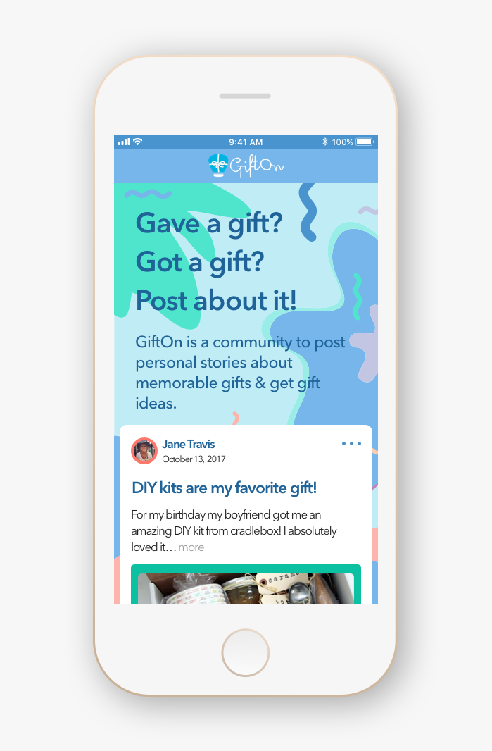
I muted the colors further to bring out the content of each card more as some users commented the colors felt childish
I changed out the photography to include more gift related photos rather than people as one user expressed the design felt too vacationy and beachy
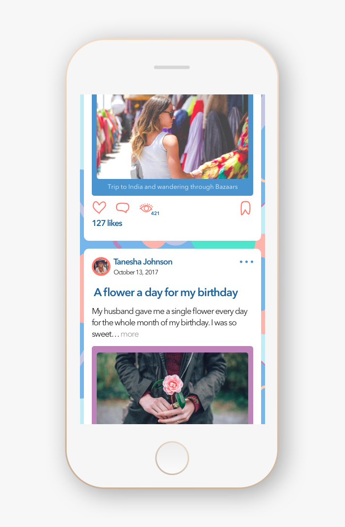
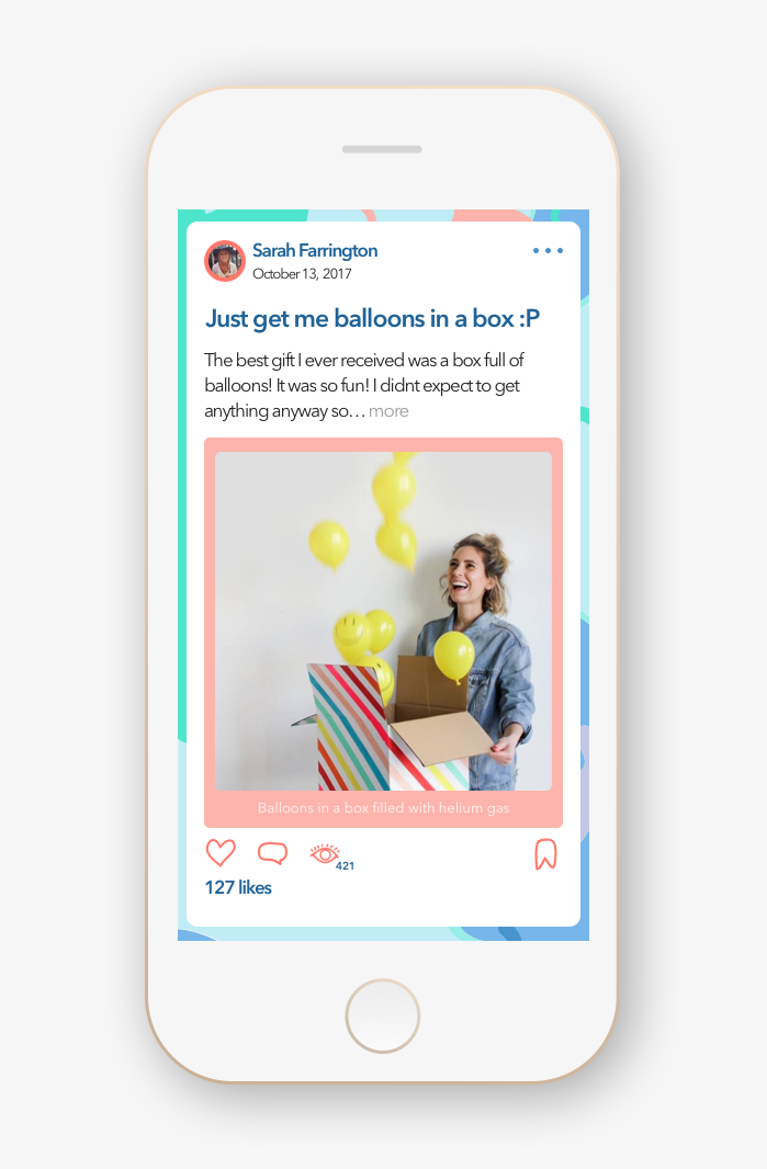
I included a title for the posts to draw the user attention to the gift story, as users expressed they looked at the photos, but didn’t look at the text at all
I kept the community spotlight and categories below user posts as users expressed they liked not feeling “pressure to follow someone off the bat,” and “free to explore first”
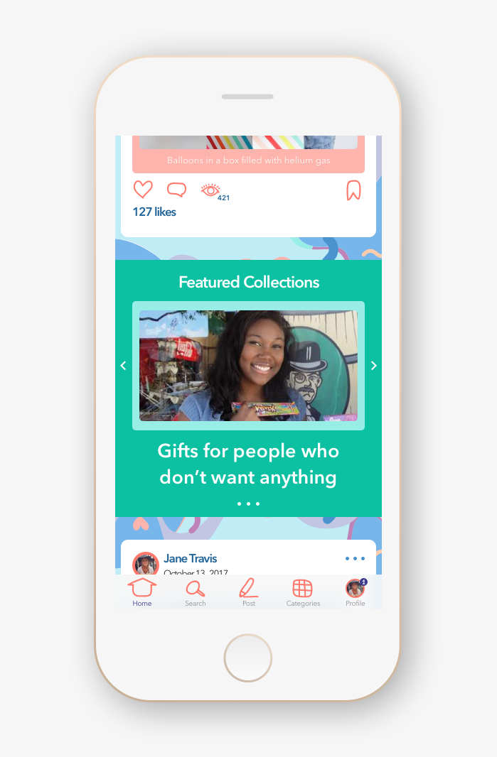
Gifton expressed that they really liked my design decisions and particularly the choices I made to evoke an easy, intuitive, social media feel. The team thought that my designs achieved their primary goal of letting users know the site was for sharing gift stories and finding inspiration and they enjoyed how much fun the colors and hand drawn elements brought to the site. The founder also appreciated my design decision to combine the posting flow into one screen.
For the next sprint the Gifton CEO wanted our team to focus on designing and testing four key areas:
- Sponsored posts
- Comments
- Profile search results
- Desktop layout
I was very glad that my designs resonated so well and I was eager to begin exploring the additional screen areas identified. I felt that I had a strong system in mind for the direction my screens would take. Additionally, I wanted to simplify my designs further and create a fully flushed out prototype for the following week of user tests. With a complete prototype I could see how intuitive my designs really were while still evaluating my aesthetic considerations across multiple screens.
Prototype Testing
In the prototype I walked users through the flows of exploring a post, creating their own post, and searching for another user. Within these I included the focus areas of sponsored posts, comments, and search results that Gifton asked for. Our team again tested with five users, four of whom were women between 25 and 35 and one man in his 30’s. All of our users were proficient in technology, but haven’t heard of Gifton before testing with us. Users responded really well to my prototype and navigated through the various functions with ease. Correspondingly, the changes I made to my final design weren’t drastic and mostly included flushing out a few key areas.
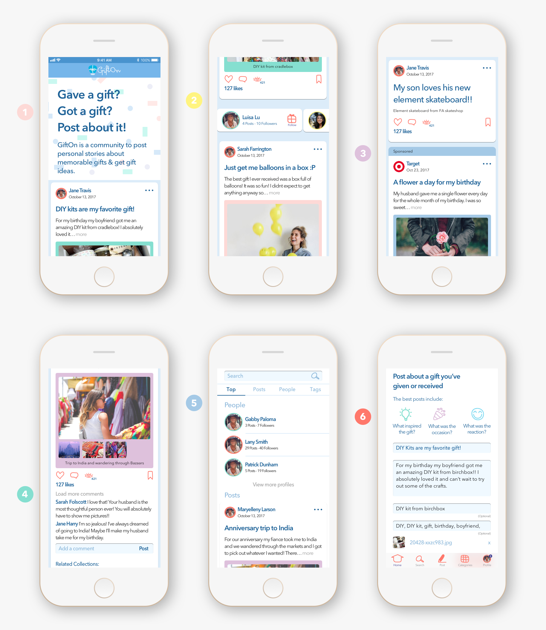
- Two users still felt the background was slightly distracting so I further muted the colors to act secondary to the content and changed the header design to build on the system of rounded rectangular elements
- Users liked the illustrative icons, but I cleaned them up and added active states
- Users liked the sponsored post treatment and expressed that it was sufficiently visible
- Users easily identified the comment section and the comment icon
- Users knew exactly where and how to search, and found the presentation of the search results intuitive
- Users found the posting screen intuitive and delighted in the illustrative elements
Interestingly, all of our users also expressed that they would gladly browse the site but wouldn’t post on it. Inquiring as to the reason for this, we learned that with an overwhelming number of social sites, most people prefer to contribute content to only one or two. Keeping this in mind, I wanted to make posting as easy and painless as possible in my desktop design. I incorporated my takeaways from analyzing other social media sites and created a quick and clear posting area in the top left below the header, while maintaining the flow of the page.
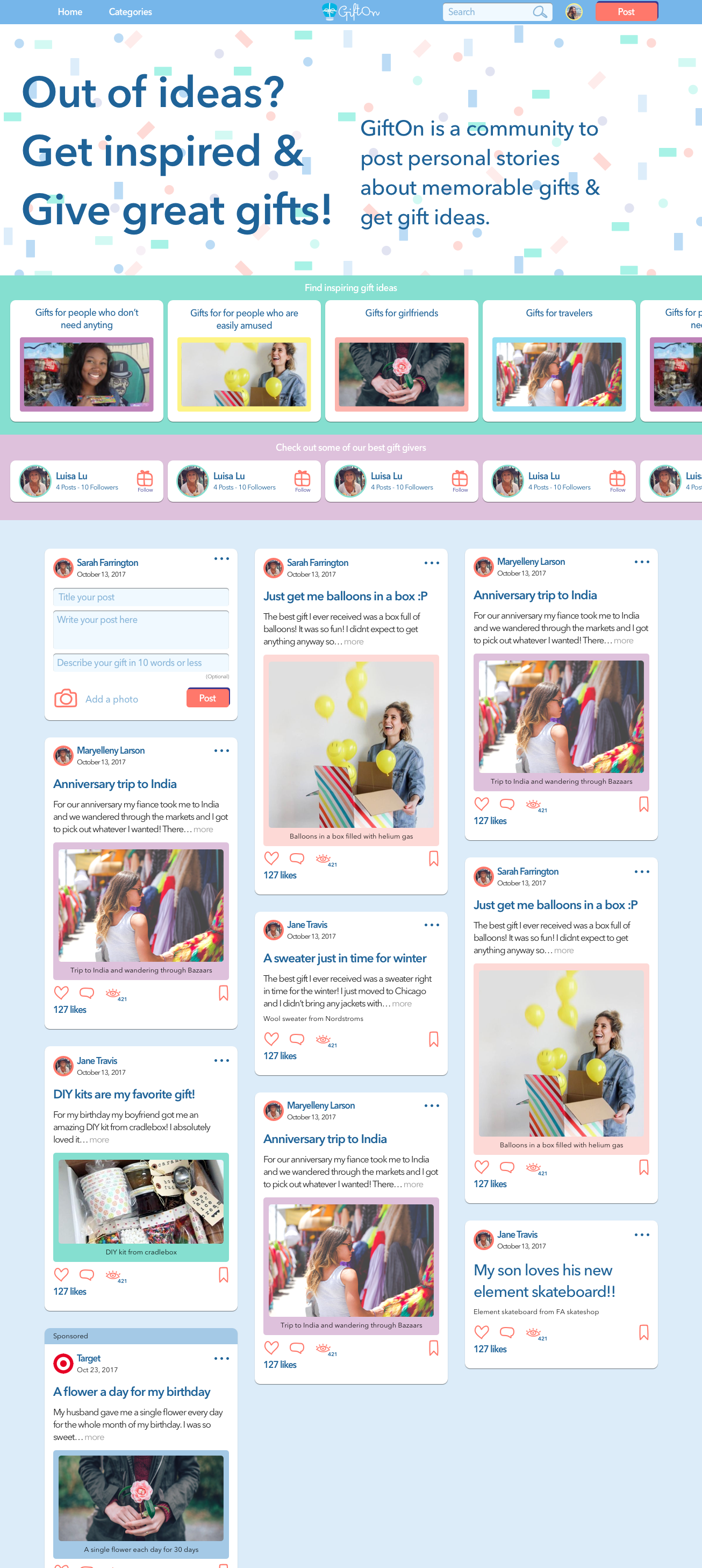
The Gifton team really liked and appreciated all of our designs and expressed that they would be quick to implement changes to their site. They still loved the social media feel and layout of my cards, with a profile image and name up top to communicate that these were stories from real people, and a bold header to draw the user’s attention to the story without overwhelming them with text. They also liked my proposed treatment of sponsored posts and posts with no photo.
What I Learned
Working on this project allowed me to explore designing for an audience I was less familiar with. It was really fun to step out of my comfort zone and learn about other websites and corresponding visual elements that appealed most to our target audience. What was also an interesting learning experience was handing off my designs and style guide to Gifton and immediately jumping into another project. The Gifton team wanted to move quickly in their process and they received four individual designs and style guides from our team. Thus, while we were half way through working for our next client, we received updates from Gifton on the changes they began to make to the site. Gifton adopted many of my designs and suggestions, but to my surprise combined many of them with elements from another designer on my team. They also got help from an outside UX designer, who was less familiar with our design decisions, and the resulting site fell short of what I had excitedly envisioned. This was a great lesson in how important it is for me to work at a place where I can actively collaborate with engineers and clarify or build on any designs throughout the lifecycle of a product. From several years of working in tech I know that priorities or business objectives often change. As a designer, I want to be an available resource in that process so as to create the best possible final product for the users.

